Design comparison
Solution retrospective
Took a while trying to optimize for mobile.
Comments on bugs or formatting issues welcome. Thanks!
Community feedback
- @ApplePieGiraffePosted almost 4 years ago
Hey, David Payne! 👋
Nice work on this challenge! 👏
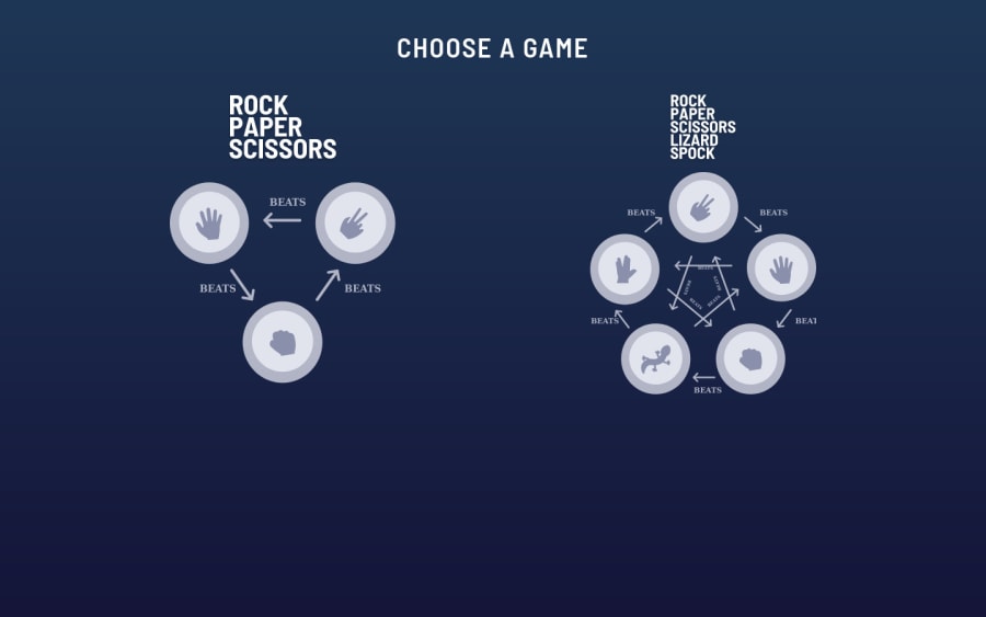
I really like that you can choose between which version of rock, paper, scissors you want to play! The animations are cool, too! 😎
I only suggest,
- Allowing users to scroll in the desktop layout of the site. Currently, vertically scrolling is disabled in the desktop layout of the site, meaning some of the content is cut off of the page and unreachable on smaller desktop screens.
Keep coding (and happy coding, too)! 😁
2@dpayne713Posted almost 4 years ago@ApplePieGiraffe Thanks! Yeah I need to spend more time on screens with limited height.
0 - @mattstuddertPosted almost 4 years ago
Awesome work on this challenge, David! Really nice touch adding the option to choose the game at the beginning!
1@dpayne713Posted almost 4 years ago@mattstuddert
Thanks Matt! That means a lot.
This one was great for dry JavaScript implementation and mobile formatting.
Enjoying the challenges!
0@mattstuddertPosted almost 4 years ago@dpayne713 awesome to hear you’re enjoying the challenges!
Yeah, it’s nice to see you went with plain JS. The animations add a nice layer to it as well.
Keep up the great work!
0 - @MasterDev333Posted almost 4 years ago
Great work David. Your solution is spot on. User friendly and fully responsive. It's the best solution for this challenge, I've been so far. Look forward to seeing other solutions from you. Happy coding~ :)
1
Please log in to post a comment
Log in with GitHubJoin our Discord community
Join thousands of Frontend Mentor community members taking the challenges, sharing resources, helping each other, and chatting about all things front-end!
Join our Discord
