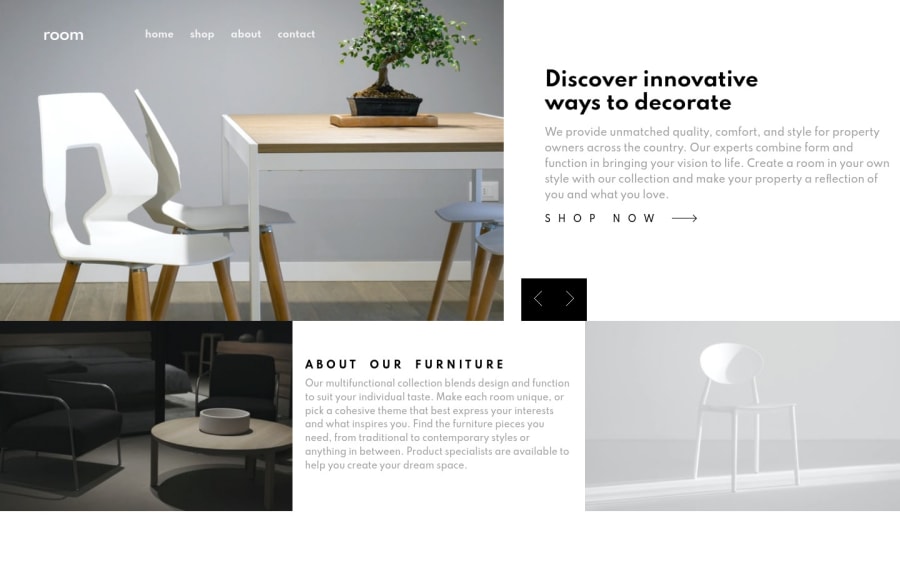

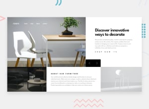
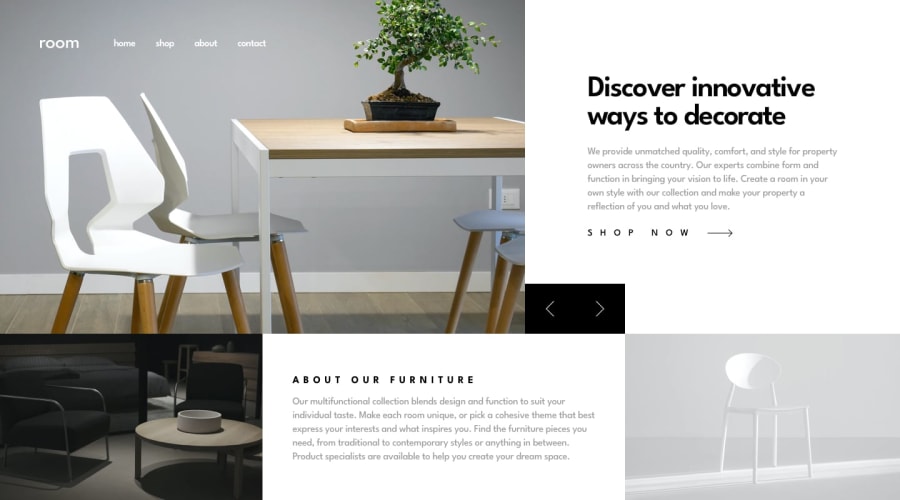
Design comparison
Solution retrospective
I made it using sass any feedback is appreciated!! :)
Community feedback
- @pikapikamartPosted about 3 years ago
Hey, awesome job on this one. Layout looks really good in desktop, it is responsive and the mobile layout is good as well.
Some suggestions besides Marlon's great feedback again^:
- You don't need the first
divthat captures the whole layout. You could just use thebodytag on this one. Also a preferred structure would be:
<body>
  <header />
  <main />
  <footer />
</body>
This way, all content will be inside a landmark elements.
- Just to say it first, making carousel to be accessible is really hard, just pointing it out :>
- The website logo shouldn't be inside a
navelement, since it is not really a navigational link of your website. Only those 4 elements after it is needed. - The
altvalue for theimgof the website logo should have beenalt="room", since the website itself is named by that, better using it as a value for the website-logo'saltattribute. - Always use only 1
h1per webpage. It would be great if theh1on this would be asr-onlytext. This means the text will only be visible to screen-reader users. shop nowshould be a link usingatag.- The
buttonto change the carousel should havearia-labeldefining what thebuttondoes. For example, thebuttonfor the next carousel item, it should be:
<button aria-label="next carousel item"> </button>This way, there is an information on what this
buttonwill do.MOBILE
- The hamburger menu should have been using
buttonelement and not justdiv. Using justdivmakes it un-accessible for keyboard and screen-reader users. Always use interactive html element for an interactive component. - The
buttonthat you will use in the hamburger should havearia-label="navigation menu dropdown"so that users will know what thisbuttondoes. Thebuttonshould also havearia-expanded="false"as default value, and you will toggle it to true by javascript, if the user toggles thebutton, then you just cycles it.
Aside from those, really great job on this one.
Marked as helpful1 - You don't need the first
- @MarlonPassos-gitPosted about 3 years ago
hello, I didn't do this challenge so I'm not aware of the difficulty, but in my head it seems that it would be easier to do if you had used CSS GRID, I don't know but it seems.
-
where it says "SHOP NOW" should be an anchor element that would take the user to another page, so I would put it inside an <a> tag
-
It may seem strange, but it is recommended that you put in your images some size in the html, as this prevents the page does not move when loading
-
"ABOUT OUR FURNITURE" could be a <h2>, it doesn't make sense for you to use an h3 on the page if you didn't use h2, never skip
-
It would be nice if we could switch images using the arrow keys on the keyboard.
-
I see a few HTML issues in the report, perhaps it's worth taking a look at them!
otherwise I liked it, it was very similar to the original version
Marked as helpful1 -
- @Adil-AkothiatPosted about 3 years ago
=> Thanks all for this great ideas, I will work on it and improve the live site in the future.
0


Please log in to post a comment
Log in with GitHub
Join our Discord community
Join thousands of Frontend Mentor community members taking the challenges, sharing resources, helping each other, and chatting about all things front-end!
Join our Discord