Design comparison
SolutionDesign
Solution retrospective
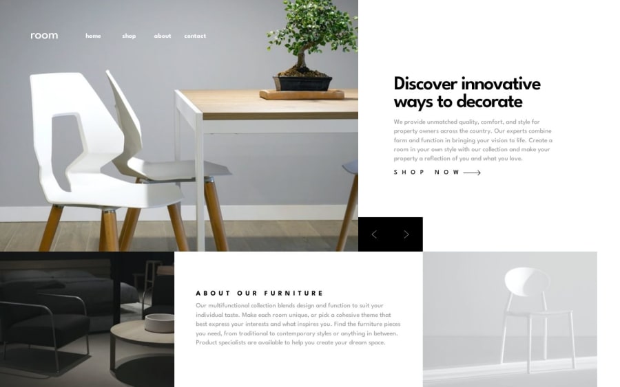
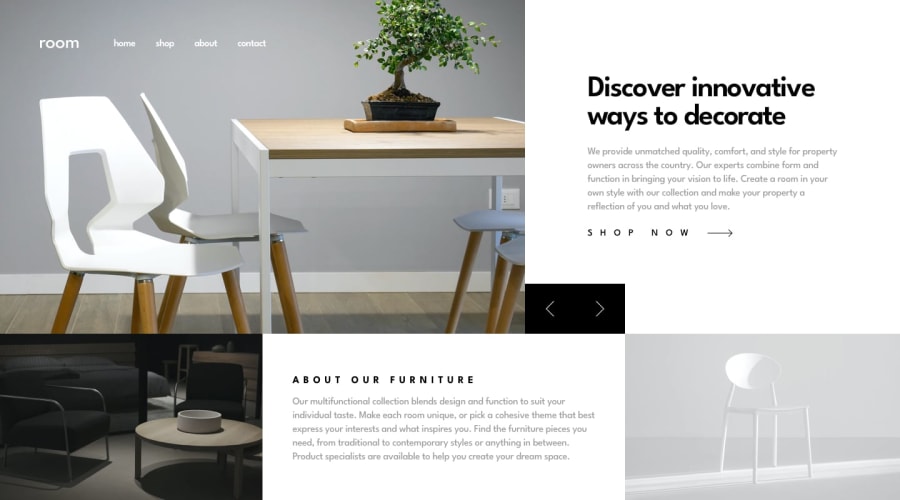
This project was great for practicing layout and positioning. It took a while for me to get the arrows in the desktop version to stay aligned with the image in the about section without disrupting the whole layout.
It was also nice to figure out how to control the slideshow with keyboard presses. I usually don't use keyboard events with normal websites, so it was nice to have a reason to practice it again.
Community feedback
Please log in to post a comment
Log in with GitHubJoin our Discord community
Join thousands of Frontend Mentor community members taking the challenges, sharing resources, helping each other, and chatting about all things front-end!
Join our Discord
