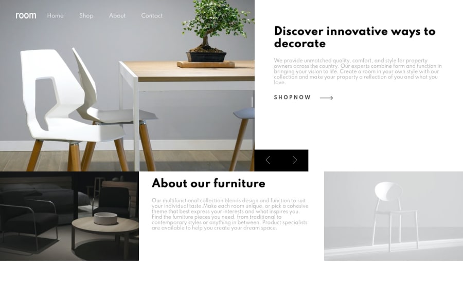

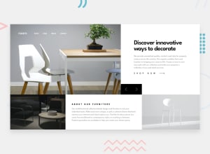
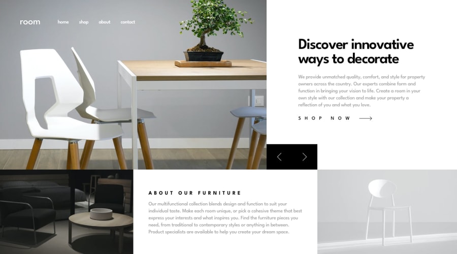
Design comparison
SolutionDesign
Solution retrospective
Any feedback will be greatly appreciated.
Community feedback
- @DestinyIJPosted over 4 years ago
This is entirely my opinion.
I think the right/left button is unnecessary and does not provide a good aesthetics. You can try to animate the message instead of one having to click on the button. Better still, place the blocks below one another.
0

Please log in to post a comment
Log in with GitHubJoin our Discord community
Join thousands of Frontend Mentor community members taking the challenges, sharing resources, helping each other, and chatting about all things front-end!
Join our Discord