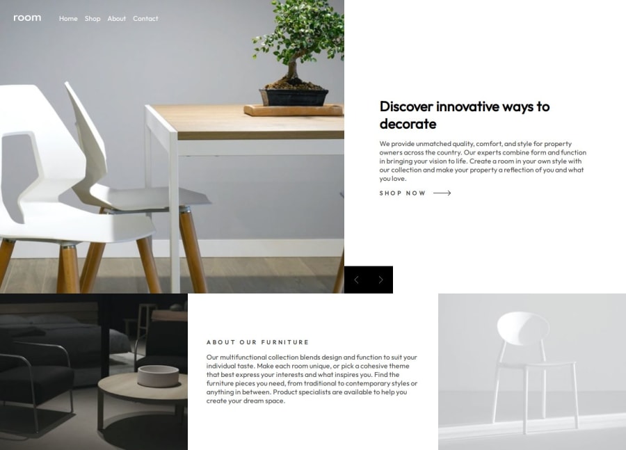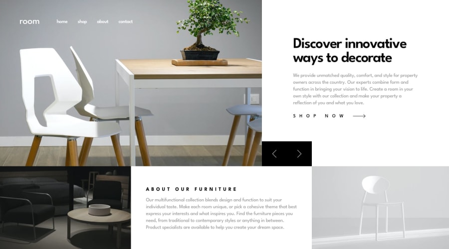
Design comparison
SolutionDesign
Solution retrospective
What are you most proud of, and what would you do differently next time?
Its an amazing thing working on this project. I did some magic while building this page. Next time i would do more magic.
What challenges did you encounter, and how did you overcome them?I encounter some challenges while i was trying to change the image and the sections once user click on an event. I was able to figure that out with the use of an object thats is containing all the information that i need.
What specific areas of your project would you like help with?Currently, I am still learning. I need help with everything you can think of.
Community feedback
Please log in to post a comment
Log in with GitHubJoin our Discord community
Join thousands of Frontend Mentor community members taking the challenges, sharing resources, helping each other, and chatting about all things front-end!
Join our Discord
