Room Homepage with Sass, Gridbox & VanillaJS (Mobile First)
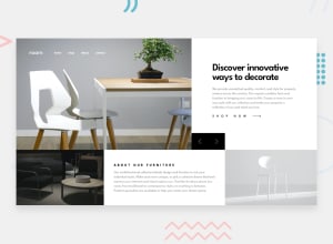
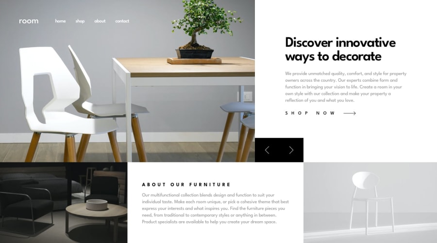
Design comparison
Solution retrospective
I enjoyed working on this project. Feedback is appreciated!
Community feedback
- @ApplePieGiraffePosted about 4 years ago
Hey, wonderful job on this challenge, Miquel! 👍
Your solution looks great and responds really well! (I especially like how it grows to fit the entire area of the viewport even on larger screens—a detail often missed on this challenge.) 🤩
I also like the smooth transition between slides on the page! 😉
Happy coding! 😁
1@mrjayy5Posted about 4 years agoHi ApplePie, thanks for the feedback!
Made some responsiveness improvements in the code. Also made some UX improvements. It's now possible to break out of the mobile navigation by clicking outside of it.
0@ApplePieGiraffePosted about 4 years ago@mrjayy5
Just checked it out again! Good work! 🙌
Adding that feature to close the mobile menu by tapping outside of it was a nice idea!
0 - @rfilenkoPosted about 4 years ago
Hey Miguel, great work on this one, clean, nice code and responsive as well. Found few smaller issues:
- add some transition for menu links(hover effect, add focus states as well);
- hiding overlay by default, adding transition to it on a show;
- slider buttons can be buttons;
- grid properties can be written with shorthand like grid-template-column: 3/4 or using grid area to make it simpler.
Hope this was helpful. Have a good one, Roman
0
Please log in to post a comment
Log in with GitHubJoin our Discord community
Join thousands of Frontend Mentor community members taking the challenges, sharing resources, helping each other, and chatting about all things front-end!
Join our Discord
