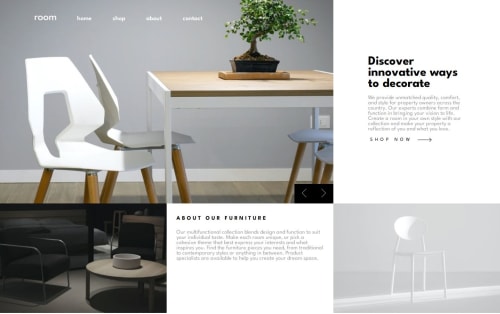
Submitted about 1 year agoA solution to the Room homepage challenge
Room Homepage with Grid and Flex
@imandreans

Solution retrospective
What are you most proud of, and what would you do differently next time?
I'm proud that I can design the mobile view first. Next time I need to pay attention more to the resolution and the layout.
What challenges did you encounter, and how did you overcome them?It's really hard to make the grid of screen view, so I kept trying till I get it right.
I also had a hard time to build the slide effect when click the arrow button. I solved it by asking claude AI for a code. After I implemented the code, I analyze the code.
What specific areas of your project would you like help with?I think more on the design, because there a lot of things I want to fix on this current design.
Code
Loading...
Please log in to post a comment
Log in with GitHubCommunity feedback
No feedback yet. Be the first to give feedback on andrean-sihombing's solution.
Join our Discord community
Join thousands of Frontend Mentor community members taking the challenges, sharing resources, helping each other, and chatting about all things front-end!
Join our Discord