Room Homepage with CSS Transitions and JS (GSAP) Animations
Design comparison
Solution retrospective
Hey, everybody! π
I've given a lot of feedback on this particular challenge, and now it's my turn to give it a go! I hope I did okay! π
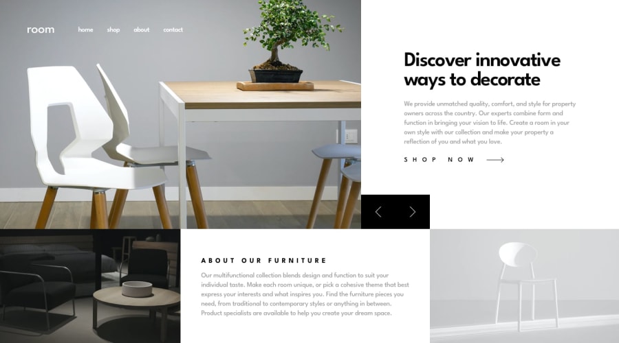
I ended up coding a lot more Sass and JS than I initially expected, but I learned a lot. I decided to put the slider images in my HTML so that I could use the <picture>
element for responsive images but stored the text in my JS (feedback on my JS would be appreciated).
I added some cool transitions to the mobile menu and navigation and created an intro animation (using GSAP) after stumbling upon this YouTube video and remembering Connor Z did the exact same thing (and blew me away when I saw it) when he completed this challenge! π
More importantly, I tried to ensure that the design scales up and down nicely (which gave me quite a headache because of this behavior of flexbox), but I think I managed to do it okay in the end.
Of course, feedback is welcome and appreciated! π
Happy coding, everyone! π
Community feedback
- @DytomaPosted almost 2 years ago
Your solution is amazingππ.
Can you please tell me How you managed to get this wonderful animationsπ .
1@ApplePieGiraffePosted almost 2 years ago@Dytoma
Thank you very much! π
I learned how to create the animations for my solution from this YouTube video by one of my favorite coding YouTubers, Dev Ed.
The animation library I used is free and it's called GSAP. You can check it out here.
Hope that helps you! π
1 - @mattstuddertPosted about 4 years ago
Hey APG, you've done a really great job on this challenge. Your solution is a good representation of the design, scales up/down very well, and the added extras with the animations and the transitions give it a beautifully polished feel π
I've only got two small suggestions on things to tweak:
- You don't actually need the second
source
inside yourpicture
elements, as theimg
at the bottom will act as the fallback if the other conditions aren't met or the browser doesn't support thepicture
element. - You've done a great job of thinking about accessibility and how people might use the keyboard to navigate the page. One thing you could add is the
aria-live="polite"
attribute to the.hero__text-wrapper
element to make sure the content changes are announced to screen reader users. Here's the MDN page for aria-live for more information.
Keep up the amazing work! π
4@ApplePieGiraffePosted about 4 years ago@mattstuddert
Thanks for the feedback, Matt! π
Those tips are great! π
0 - You don't actually need the second
- @brasspetalsPosted about 4 years ago
Apologies, as I have nothing constructive to say. Yet another fantastic job that I am bookmarking for reference! π
2@ApplePieGiraffePosted about 4 years ago@brasspetals
Awww... Β thanks, Anna! π
0 - @jomefavouritePosted almost 4 years ago
Wow, the animations are just amazing π€©
1@ApplePieGiraffePosted almost 4 years ago@jomefavourite
Thanks, jomefavourite! π
1 - @posivibezPosted almost 4 years ago
Awesome work. Love the intro animation, so cool! Referencing your work was very helpful for me. Thank you.
1 - @ezraguyPosted almost 4 years ago
Hey @ApplePieGiraffe, your solution is absolutely beautiful, WOW. very professional! great job!
1 - @kvncnlsPosted almost 4 years ago
Hey APG! Your site is awesome! Can I ask how you made the navbar close when you have it open on mobile/tablet size then expand to desktop size?
So let's say your window was 500px width, you open the navbar menu, then you expand the window passed the navbar menu limit (where the hamburger menu should disappear). How did you get the navbar to close automatically? I don't think I saw an event listener on window resize.
1@ApplePieGiraffePosted almost 4 years ago@kvncnls
Hey, kvncnls!
If I remember correctly, I put all of the styles of the mobile navigation inside a media query so that they only apply to the mobile navigation when the screen width is below a certain point (like, 800px or 1000px or something). If the screen width is ever above that point, the styles of the desktop navigation get applied so that the mobile navigation "automatically" switches between desktop and mobile layouts. IDK if it's perfectβbut it seemed to work okay for this challenge! π
Happy coding! π
1 - @artimysPosted about 4 years ago
Hey there APG, I didn't realize you submitted a solution. Got to say it's pretty baller. High praise π. Not sure if this is intentional on your part but when shrinking the browser width to 999px. The mobile nav appears prematurely and hides.
Great job π
1@ApplePieGiraffePosted about 4 years ago@artimys
Thanks, artimys! π
Yeah, I decided to hide the mobile navigation before completely switching to a mobile-friendly layout so that the navigation links too look too squeezed or anything. π The mobile navigation flashes due to the transition I put on it, but I didn't worry about it too much since I don't imagine most users will be resizing the page (they will just either be in the mobile layout or the desktop layout) and if they did, it would simply be a small quirk in the design. But that was just my train of thought!
0 - @zuolizhuPosted about 4 years ago
Coming from your comment on my solution π I really love your design on the scales up and down, it just looks amazing π! One little detail you can try next time, when using tab navigating on those buttons, you can add
:focus { outline: rgb(104, 190, 205) dotted 3px; }
(This is how frontendmentor.io did on their buttons and input box π€)
I think your skills of HTML CSS and JavaScript are solid enough, you could try some frameworks (I highly recommend Svelte since it's not that different from no-framework) to help you manage your code, e.g. for this project, you can split the
index.html
intoheader
,carousel
,about
etc components, and makes it a lot much easier to maintain when you keep adding details latter on π.As always, keep coding πͺ and happy coding π!!
1@ApplePieGiraffePosted about 4 years ago@zuolizhu
Thanks so much! π I'll take your advice and learn something new!
Funny you should recommend learning Svelte because I was looking around at JS frameworks last night and out of all of them couldn't stop reading the Svelte tutorial! π
Happy coding to you, too!
1
Please log in to post a comment
Log in with GitHubJoin our Discord community
Join thousands of Frontend Mentor community members taking the challenges, sharing resources, helping each other, and chatting about all things front-end!
Join our Discord