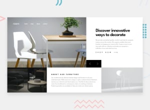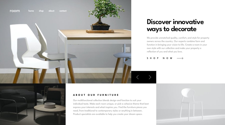
Design comparison
Solution retrospective
im happy with the final result, next time i'd try to make the js more DRY
What challenges did you encounter, and how did you overcome them?i had some issues with the layout and making it look good on medium-sized screens, in the end i think it looks fine enough even though it's very simple and maybe not the prettiest
What specific areas of your project would you like help with?any feedback as to if i'm doing a good job with accessibility and how to improve
Community feedback
- @Yejin-HanPosted 4 months ago
First of all, thank you for your hard work. It must have taken you quite a while to re-layout the mid-size screen.
I'll briefly tell you the problem I've checked. There is an error that the mobile version of the menu is maintained if you open the menu once in the mobile size and resize it to the desktop size. There are parts that are very slightly different in layout or size from the given design, but overall, it seems to have been completed well.
In addition, it's amazing that you scripted the slide yourself! However, there are many parts that seem to have been scripted even if you don't have to use the script, so I'm worried that if there are more of these codes, there will be performance problems. It would be good to consider creating a class and toggle it.
Thank you.
Marked as helpful0@tortarugaPosted 4 months agoThank you @Yejin-Han!
I hadn't noticed the issue with the mobile menu on resizing the screen, I fixed it now.
And yes you're right I think I made it all more complicated than it needed to be 😅 I'm not very good at this yet, so sometimes my solutions are not very efficient. I'll keep it in mind in the future. Thank you again for your comment, I appreciate it very much!
0
Please log in to post a comment
Log in with GitHubJoin our Discord community
Join thousands of Frontend Mentor community members taking the challenges, sharing resources, helping each other, and chatting about all things front-end!
Join our Discord
