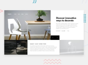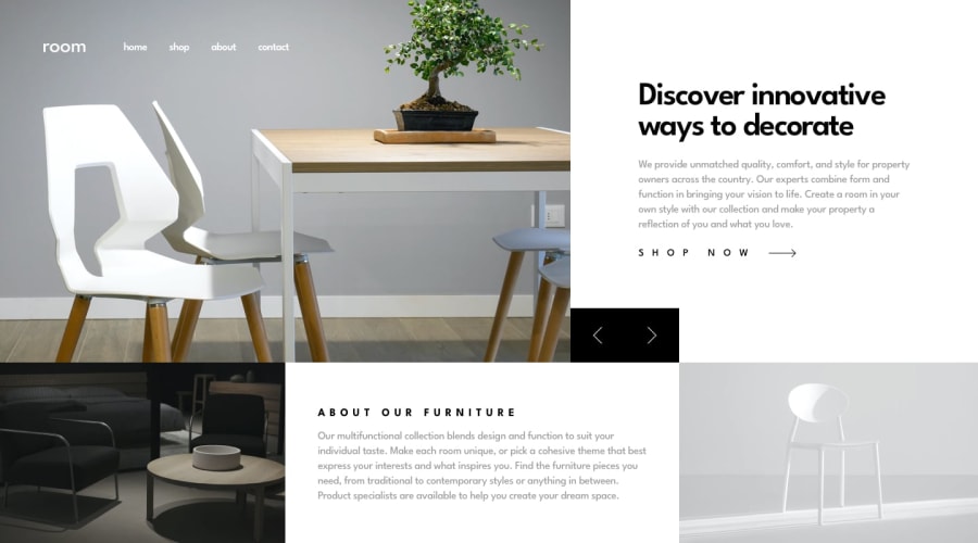
room homepage ,very interesting project I had done so far.!
Design comparison
Solution retrospective
this project challenged both my emotion and knowledge ,but i learned alot while um struggling to finish it .!best project to jump from junior level to intermediate ones web developer...!any feedback is welcom on how to improve the structure of my coding
Community feedback
- @mattstuddertPosted about 4 years ago
Nice work on this challenge, Eyob! What were the major things you learned while working through this project?
I'd recommend removing the container that you've got wrapped around the content with the
box-shadow. You can see in the design that the content goes all the way to the edges. So I'd make it so that your solution does the same.Also, have you ever tried using
min-widthmedia queries instead ofmax-width? It's quite a common workflow with front-end developers to use them and work mobile-first. It can often lead to less CSS code and has the benefit of loading in fewer styles for mobile users, which can be a nice performance gain.You've done a really good job on this. Keep it up! 👍
1@hjob-1Posted about 4 years ago@mattstuddert thank you very much for your very helpfull comment.!
0
Please log in to post a comment
Log in with GitHubJoin our Discord community
Join thousands of Frontend Mentor community members taking the challenges, sharing resources, helping each other, and chatting about all things front-end!
Join our Discord
