Design comparison
SolutionDesign
Solution retrospective
Open to any feedback!
Community feedback
- @mcktivityPosted about 4 years ago
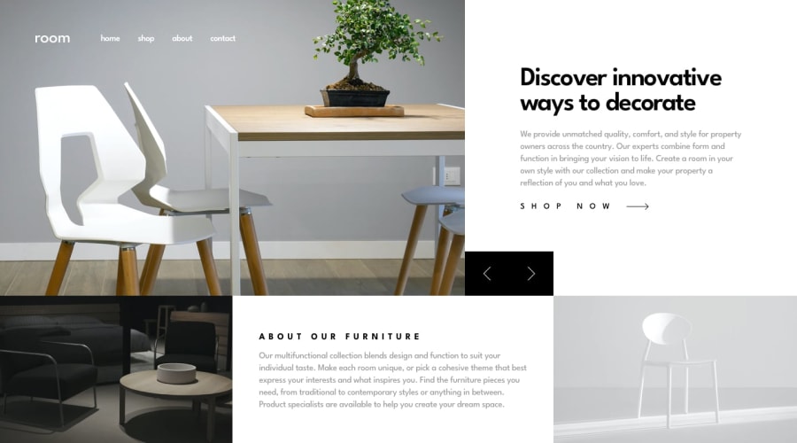
Good job! Looks almost the same as the design. A bit of suggestion for your mobile view is to add min-height on your slider. otherwise its already responsive. also try to add css on your arrow:active selector to give a click effect which is good for user experience. might as well add transition effect on the slide texts so it wont feel late.
1
Please log in to post a comment
Log in with GitHubJoin our Discord community
Join thousands of Frontend Mentor community members taking the challenges, sharing resources, helping each other, and chatting about all things front-end!
Join our Discord
