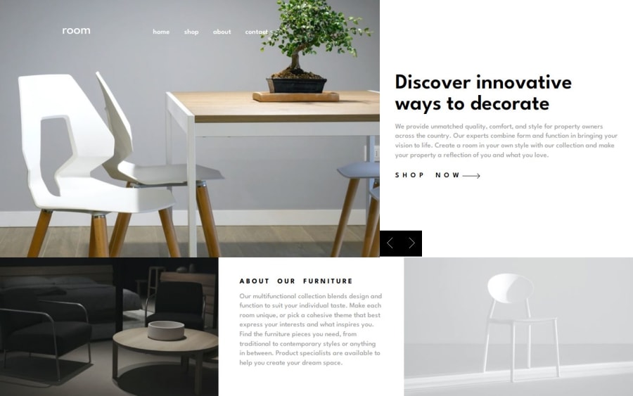

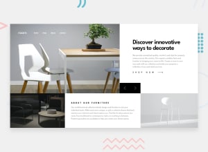
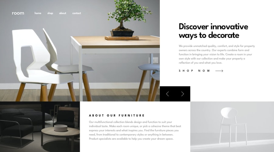
Design comparison
Solution retrospective
I a proud that I was able to style the webpage without layout breaking. Although it took me quite a while. I have gotten a great grasp on transitions too.
What challenges did you encounter, and how did you overcome them?The only challenge I have encountered was trying to add in a slide in animation for the three slides. I eventually resigned, but I am still learning.
What specific areas of your project would you like help with?I hope someone could help me understand how to include the slide-in animation to my webpage. I would higly appreciate any thoughts. On the animation, and also how to go about understanding the JS involved.
Please log in to post a comment
Log in with GitHubCommunity feedback
- @mts-ml
Hey @1deadjoe!
I like how there are no "empty" spaces when switching between different screen sizes. Did you read an article or was it just practice?
Also, I liked the arrow transition you made.
At width: 950px, the design breaks, the title and image get messed up.
As for the JS, I named all sections with the same class and used
document.querySelectorAll('.menu__bg')to select them all. Since it returns an array, I used forEach() to loop through and select the correct one to display. I'm happy with how my JS turned out, and if you'd like to check it out, I believe it could help you.Marked as helpful

Join our Discord community
Join thousands of Frontend Mentor community members taking the challenges, sharing resources, helping each other, and chatting about all things front-end!
Join our Discord