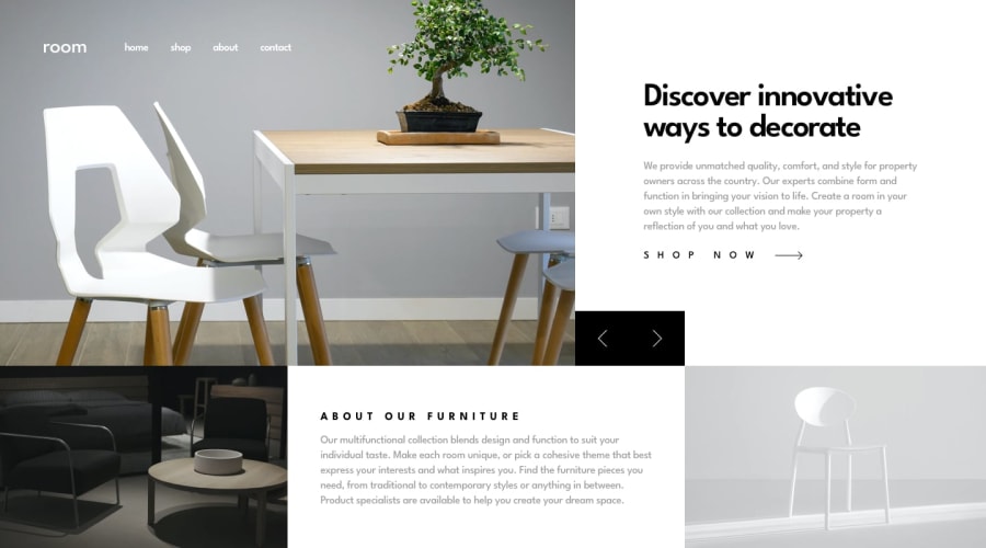
Design comparison
Solution retrospective
Please let me know what you think. I had a better time overall with images on this one. Thanks!
also for some reason the screenshot makes it look way more cramped than it actually is... lol
Community feedback
- @ApplePieGiraffePosted over 4 years ago
Hey, Christopher Till!
Sweet job!
One thing, however—on my (smaller-sized) screen, when I make the width of the viewport smaller, the two black arrow buttons occasionally hide the "SHOP NOW" link.
Otherwise, it looks good!
👍
1 - Account deleted
i finished also , nicework , your responsive not work well , but is good , lets code.
0@chri55Posted over 4 years ago@caiozim oh, in that case would ya mind telling me what I need to fix on the responsiveness? I thought it was okay
0
Please log in to post a comment
Log in with GitHubJoin our Discord community
Join thousands of Frontend Mentor community members taking the challenges, sharing resources, helping each other, and chatting about all things front-end!
Join our Discord
