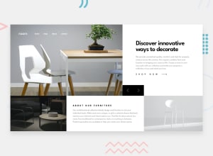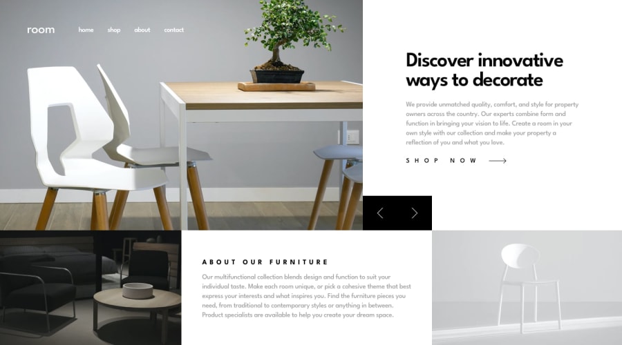
Design comparison
SolutionDesign
Solution retrospective
Feeback is welcome
Community feedback
- @ApplePieGiraffePosted about 4 years ago
Hey, Sébastien Hinard! 👋
Good job on this challenge! 👍
I like the transitions between slides and your cool attribution button at the bottom of the page! 🤩
I only suggest,
- Perhaps not using
justify-content: space-betweenfor the links in the mobile navigation menu. While this does look great on small mobile screens, there's a bit too much empty space between the links in tablet layouts. You could simply put some good ol' margin between the links and have them stick to the right side of the screen (or even center them)—which you can still use flexbox to do.
Keep coding (and happy coding, too)! 😁
0 - Perhaps not using
Please log in to post a comment
Log in with GitHubJoin our Discord community
Join thousands of Frontend Mentor community members taking the challenges, sharing resources, helping each other, and chatting about all things front-end!
Join our Discord
