Design comparison
Solution retrospective
Tailwind CSS
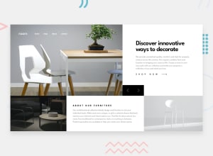
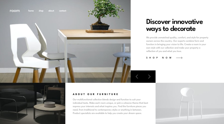
The first time I use Tailwind CSS, I will be grateful for any advice on how to use it better. The hardest part was to set up the grid according to the design. In tailwind.config.cjs I've added templates for columns and rows. Without Tailwind CSS I was using
grid-template-areas
but with it, I wasn't sure how to do it.
Resize
During resizing the page from big to small last row of the grid acted weird and I added another media query. It works better than before but still, it has white spaces I couldn't figure out another way to solve this problem.
Community feedback
- @R3styPosted almost 2 years ago
I have taken the time to view the page on different screens and I'm happy to report that it works as expected on all of them. However, when I view it on a full desktop, I noticed that the page appears to be slightly misaligned and not centered. I wanted to bring this to your attention in case it's not intended to be that way. Nonetheless, I want to commend the team for their great work on this project. The functionality and overall design look fantastic and I'm sure it will provide a great user experience. Keep up the great work!
0
Please log in to post a comment
Log in with GitHubJoin our Discord community
Join thousands of Frontend Mentor community members taking the challenges, sharing resources, helping each other, and chatting about all things front-end!
Join our Discord
