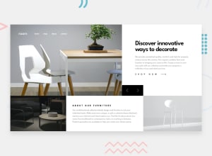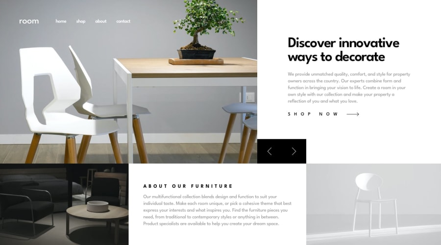
Room Homepage using NextJS + Styled-components + Typescript
Design comparison
Solution retrospective
Feel free to drop your feedback.
Thanks,
Happy Coding
Community feedback
- @shashreesamuelPosted over 2 years ago
Hey good job completing this challenge
Keep up the good work
Your solution looks great however I think that the title "Describe innovative ways to create" needs to be a bit bigger likewise the title "About the furniture". Secondly I think that the navigation bar needs some margin from the top and left.
In terms of accessibility issues simply wrap all your content between main tags
I hope this helps
Cheers
Happy coding
👍
Marked as helpful0@besttlookkPosted over 2 years ago@TheCoderGuru I have wraped the content with main tag. I always try to use semantic HTML tag as much as possible. About the size of title, i dont think much about it, i just go with my eyes.
Happy Coding
0
Please log in to post a comment
Log in with GitHubJoin our Discord community
Join thousands of Frontend Mentor community members taking the challenges, sharing resources, helping each other, and chatting about all things front-end!
Join our Discord
