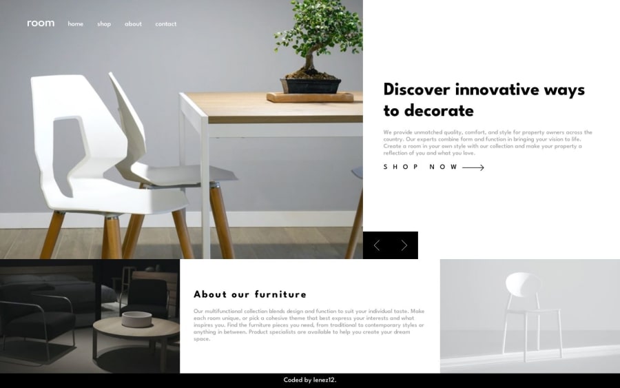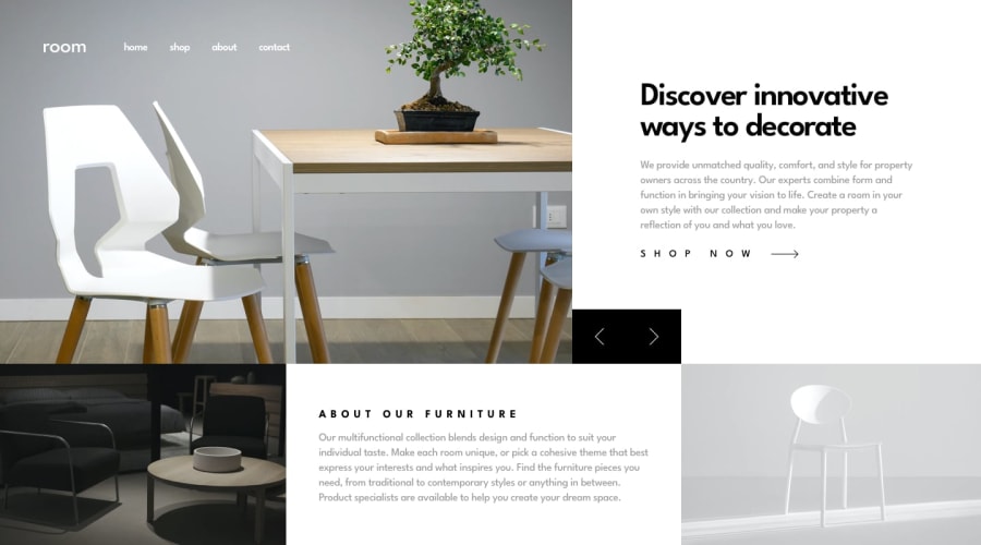
Design comparison
SolutionDesign
Solution retrospective
in this challenge i try to learn about
- layouting with grid and mobile first
- using animation
- using custom propertis
please comment if you have some stuff to fix or best practice to using it. all feedback very apreciated. thanks
Community feedback
Please log in to post a comment
Log in with GitHubJoin our Discord community
Join thousands of Frontend Mentor community members taking the challenges, sharing resources, helping each other, and chatting about all things front-end!
Join our Discord
