Room Homepage using HTML, CSS and SASS
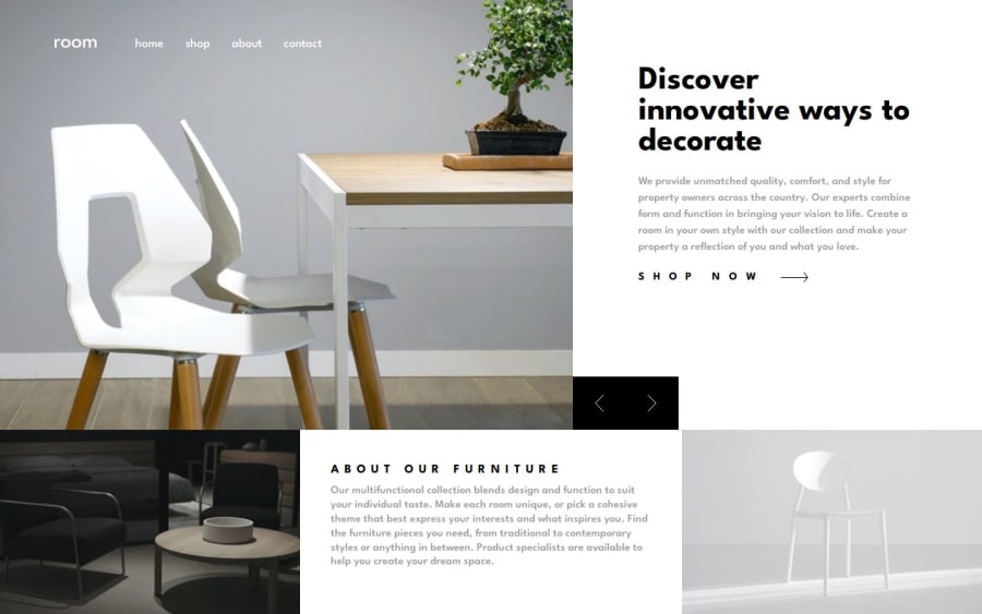
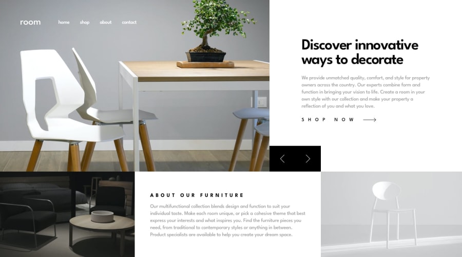
Design comparison
Solution retrospective
Hello Front-End Mentor Community! This is my solution for this challenge😊
🛠️ Built with:
- HTML
- SASS
- JS
- BEM
🤝Help / Feedback:
-
Overlay for mobile size I set
height: 342%to an overlay as the overlay won't cover entire body if I set the height 100%. Could you please help me to understand whyheight: 100%;didn't work on the overlay div? -
Overlay for mobile size I set a higher z-index number to the header nav for mobile than overlay, however, the nav went behind the overlay, so I set top position to the overlay. Any idea how to use z-index for this?
Community feedback
- @jjdavenportPosted 9 months ago
The solution does include semantic html, its clear and readable, could be improved by using the <dialog> element for the mobile menu and removing any unnecessarycode like the commented out section. The page is accessible however could be improved with aria-labels. The reason the overlay doesnt cover the entire viewport is because you mobile site has overflow although this is not a problem because it has enough content that the user needs to scroll on most viewports. In terms of z-index, think of it as layering your elements the higher the z-index the higher the layer your element will apear on, so its best to set the overlay and nav at a higher z-index for example. The only way the site differs from the design significantly is the font-family.
Well done!
0
Please log in to post a comment
Log in with GitHubJoin our Discord community
Join thousands of Frontend Mentor community members taking the challenges, sharing resources, helping each other, and chatting about all things front-end!
Join our Discord
