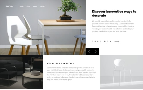
Submitted almost 3 years agoA solution to the Room homepage challenge
Room Homepage using CSS Grid + SASS + BEM
sass/scss, bem
@jesusleonel10

Solution retrospective
Layout the design was more difficult than I thought but I think I did it.
But I'm still unsatisfied with the slideshow, my intention was to create a nice transition for each content but it was very difficult, although I found some that worked I don't know if they are the most accessible because of the tags that were used between them: <a>, <s> for navigation and scrolling (if someone can recommend me some would be great)
😄✌
Code
Loading...
Please log in to post a comment
Log in with GitHubCommunity feedback
No feedback yet. Be the first to give feedback on Jesus's solution.
Join our Discord community
Join thousands of Frontend Mentor community members taking the challenges, sharing resources, helping each other, and chatting about all things front-end!
Join our Discord