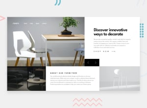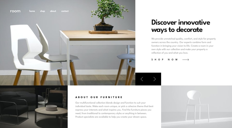
Design comparison
Solution retrospective
As a new developer I'm open to feedback on all areas of code, where I can improve, best practices, etc. I am still refining my skills using pure css to create responsive designs for mobile, tablet, desktop. Thanks!
Community feedback
- @jefcooperPosted almost 2 years ago
I have also completed this one recently. What I notice immediately with your solution is a problem I had as well. The top section and bottom section don't stay nicely aligned like in the design pictures. To address this, I went with grid which allowed me to create a tiled structure like:
aabb cdde
which I then rearranged to a column:
a b c d e
on mobile. I think this can still work with the react component approach except that you'll need some root level styles that define the grid-area specifications. See here:
https://www.frontendmentor.io/solutions/room-homepage--0m9xAUH-1 https://github.com/jefcooper/front-end-mentor/tree/main/room-homepage
0
Please log in to post a comment
Log in with GitHubJoin our Discord community
Join thousands of Frontend Mentor community members taking the challenges, sharing resources, helping each other, and chatting about all things front-end!
Join our Discord
