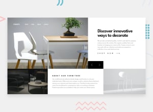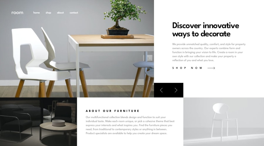
Design comparison
SolutionDesign
Solution retrospective
Back to the fold after a little time off. The right end of the control buttons doesn't line up with the light image in desktop mode, though. Nonetheless, I enjoyed this project. Hope you do, too!
Community feedback
- @ApplePieGiraffePosted about 4 years ago
Hey, Peter Hanley! 👋
Nice job on this challenge! 👍
Your solution is one of the few I've seen of this challenge that actually scales the entire design to fit the width and height of the entire viewport (others I've seen simply fill that extra space up with... white space). 🙌
Your solution also responds well!
Happy coding! 😄
1
Please log in to post a comment
Log in with GitHubJoin our Discord community
Join thousands of Frontend Mentor community members taking the challenges, sharing resources, helping each other, and chatting about all things front-end!
Join our Discord
