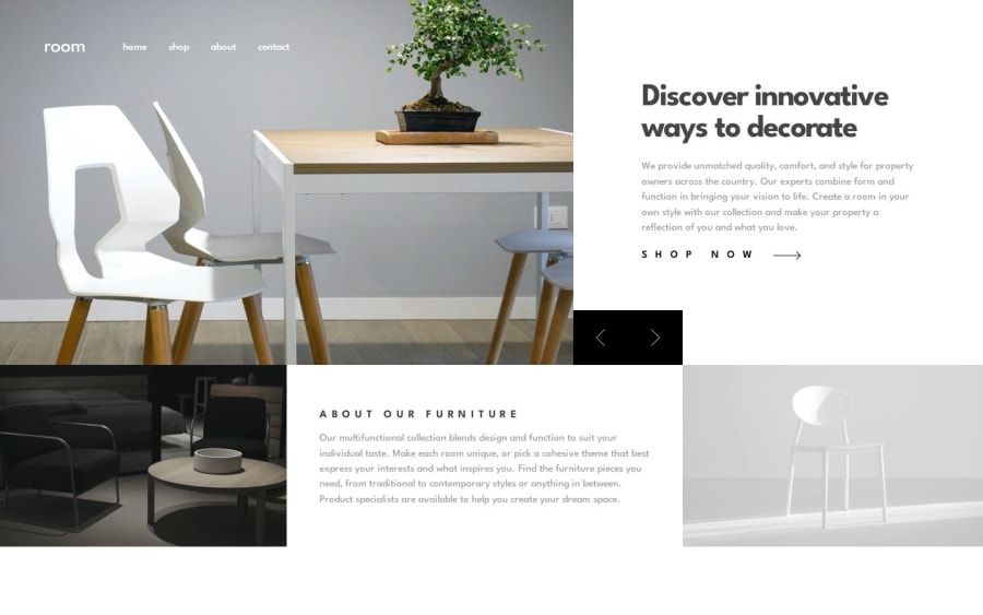
Room Homepage || React + TailwindCSS
Design comparison
Solution retrospective
Good day, everyone! 😸
This challenge for me was both fun and a real headscratcher... The fun part being the layout and the slider functionality but as soon as I moved to use framer motion on the dynamically rendered slider images for a sort of slideshow on the slider click and oh boy, everything started going haywire like crazy layout shifts that I had to take a break and just forget about it.
After coming back to it , I was just going to not use framer motion and submit it as it is but thought of giving it one more go and I ended up with a much cooler scaling effect!? 🤸🏻♂️
Now the text and the images that change with the slider have some nice animations. I would very much like to see how you guys find it!
Thanks!
Community feedback
Please log in to post a comment
Log in with GitHubJoin our Discord community
Join thousands of Frontend Mentor community members taking the challenges, sharing resources, helping each other, and chatting about all things front-end!
Join our Discord
