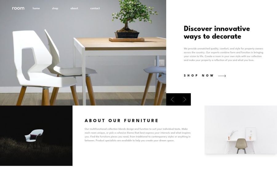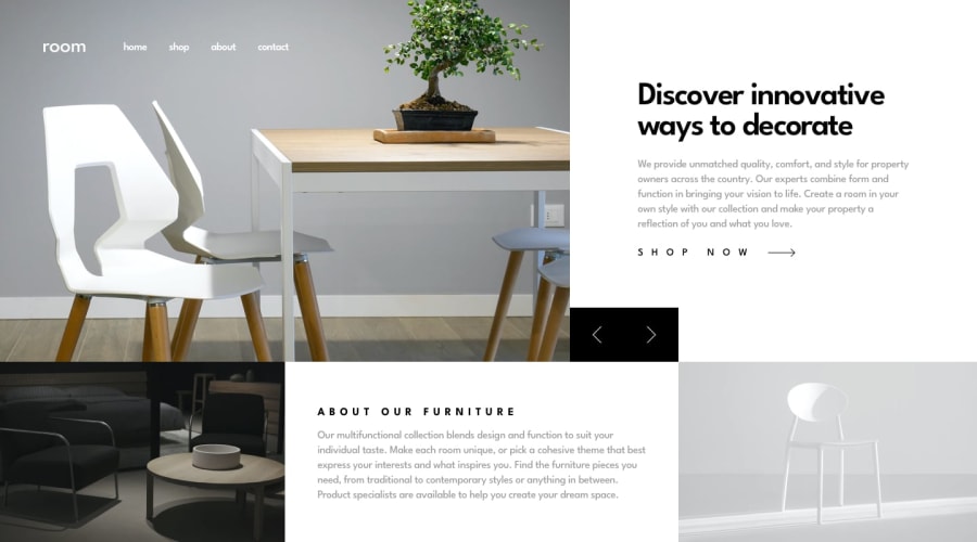
Design comparison
SolutionDesign
Solution retrospective
Hello Frontend Mentor Community,
- I took on this project to practice my GSAP animation skills and it's safe to say that I still have a lot to learn.
- However, I was able to animate the site using GSAP.
- Also, If anyone knows how to fix the weird image problem that occurs when changing the image using the arrow button, please let me know.
- I tried to find the solution but wasn't successful.
In addition to the animation, I also added:
- A ripple effect on all the buttons when clicked
- Changed a few images
Feedback is welcome. If you know how to fix the mentioned problem, please let me know in the comments. Thank you.
Community feedback
- @benjaminbillsPosted almost 2 years ago
Great Job. The fonts and responsiveness are very good. You can improve the button on the page to match the original design.
0
Please log in to post a comment
Log in with GitHubJoin our Discord community
Join thousands of Frontend Mentor community members taking the challenges, sharing resources, helping each other, and chatting about all things front-end!
Join our Discord
