Design comparison
SolutionDesign
Community feedback
- @karimsehPosted about 4 years ago
Hi Mohammed , Nice work it looks great! what i think you should improve is :
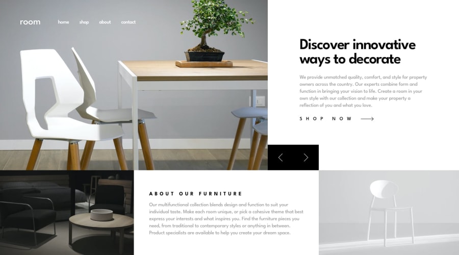
- Hover: links on navbar and arrows buttons (you should also add
cursor:pointerto it), and on shop button. - in mobile design when clicking on menu , a gray filter should fill all the screen.
- And Maybe changing the breakpoint of media query to larger one. and please check my solution for this challenge and give me feedback.
0 - Hover: links on navbar and arrows buttons (you should also add
Please log in to post a comment
Log in with GitHubJoin our Discord community
Join thousands of Frontend Mentor community members taking the challenges, sharing resources, helping each other, and chatting about all things front-end!
Join our Discord
