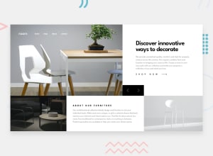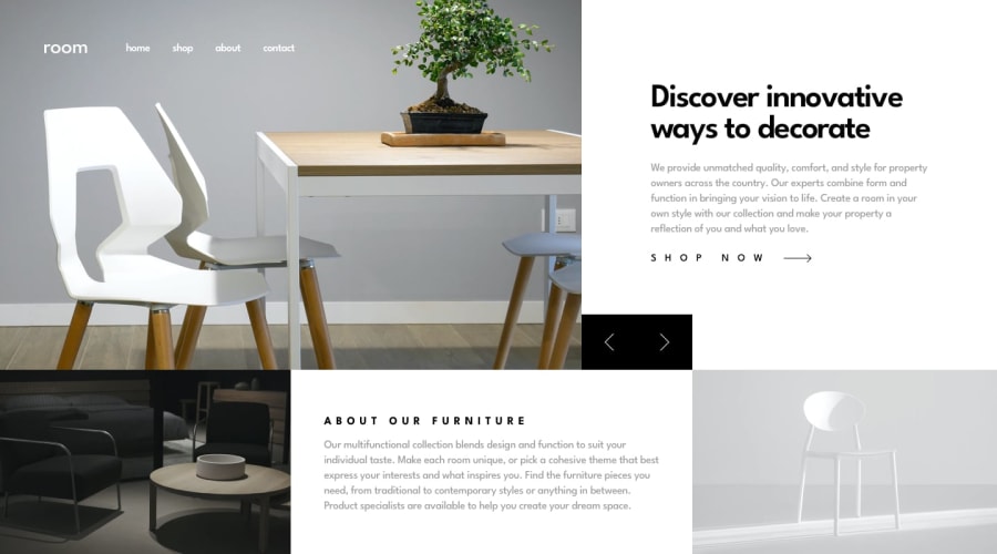
Design comparison
Solution retrospective
this project was amazing i really enjoyed it and learnt a new this with the window object would really love a feedback
Community feedback
- @palgrammingPosted over 3 years ago
you need to remove the
background-color: red;off your.heroclass0@iamdestinychildPosted over 3 years ago@palgramming it's a precaution I use for every site incase the background image don't load 👍
0@palgrammingPosted over 3 years ago@devclones1 but it currently is ruining your user experience
0@iamdestinychildPosted over 3 years ago@palgramming i just removed it kindly check it out
0@palgrammingPosted over 3 years ago@devclones1 The only thing I see is the width of your black chair images is more narrow than the other two images so that causing your whole layout to kind of shift when that image is displayed
0@palgrammingPosted over 3 years ago@devclones1 well you should open you page in the browser and them use the web developer tools to try to figure out what element and css setting is causing that behavior on your page
in this case it seems to be your
.narrationclass and the current amount ofpaddingyou are applying to your paragraphs. When you turn off the padding in the dev tools the container with stays the same for all the photos0
Please log in to post a comment
Log in with GitHubJoin our Discord community
Join thousands of Frontend Mentor community members taking the challenges, sharing resources, helping each other, and chatting about all things front-end!
Join our Discord
