Room Homepage Master using Astro, Sass and cube css

Solution retrospective
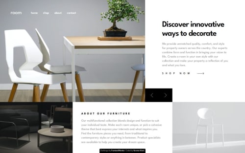
The CSS structure, organized with SASS and the CUBE CSS methodology, worked very well and kept the code clean and modular. Using Astro components also improved the code structure, making it more readable. Next time, I might try a framework like Tailwind CSS to streamline styling even further and to make styling faster and more consistent.
What challenges did you encounter, and how did you overcome them?One main challenge was setting up the CSS Grid layout, especially achieving an overlapping effect between the header and main sections. This required a careful setup of grid rows and columns, particularly in the desktop view. Experimenting with different grid configurations helped achieve a result close to the design. For animations, I kept them straightforward—one for site load and another for the image slider transition. Keeping these animations simple made them manageable to implement effectively.
What specific areas of your project would you like help with?Feedback on CSS structure and animations would be very helpful. Suggestions on improving the CSS organization or refining the animations would be useful, especially if there are ways to make them more effective without extra complexity. Also, any recommendations for improving HTML, JavaScript, or accessibility would be appreciated, as these adjustments could enhance the code’s overall quality and accessibility.
Please log in to post a comment
Log in with GitHubCommunity feedback
No feedback yet. Be the first to give feedback on Kamran Kiani's solution.
Join our Discord community
Join thousands of Frontend Mentor community members taking the challenges, sharing resources, helping each other, and chatting about all things front-end!
Join our Discord