Design comparison
Solution retrospective
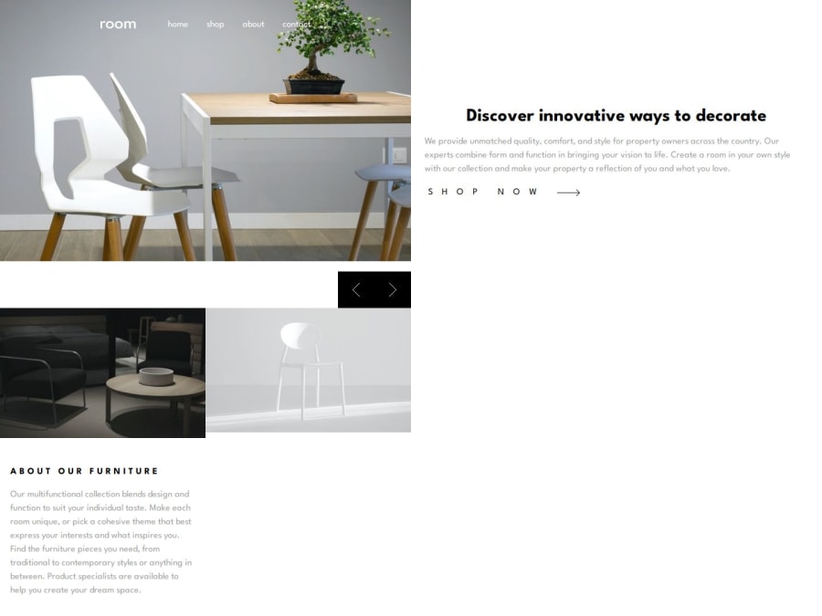
I was able to do the mobile version but due to inexperience I am not able to do the desktop version, will need to retry.
What challenges did you encounter, and how did you overcome them?I did the sliders using only js and css classes. But I realized I could do it another way which allows for animations.
What specific areas of your project would you like help with?I realised my planning with Grid isn't so good, so if there are any tips with grid I can use please inform me.
My slider is made with only js and css but it does not allow for animations. Maybe I can have tips on how to do that ?
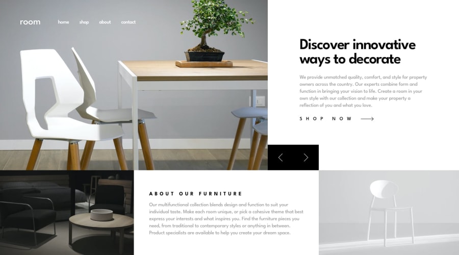
For people who are reading the code Header = first row
Header__section2 = "Discover innovate ways to decorate page'
header__section3 = image + "About our furniture"
picture__section4 = image
Community feedback
Please log in to post a comment
Log in with GitHubJoin our Discord community
Join thousands of Frontend Mentor community members taking the challenges, sharing resources, helping each other, and chatting about all things front-end!
Join our Discord
