

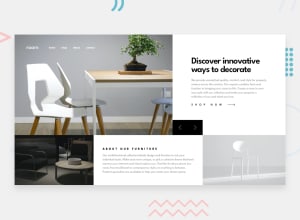
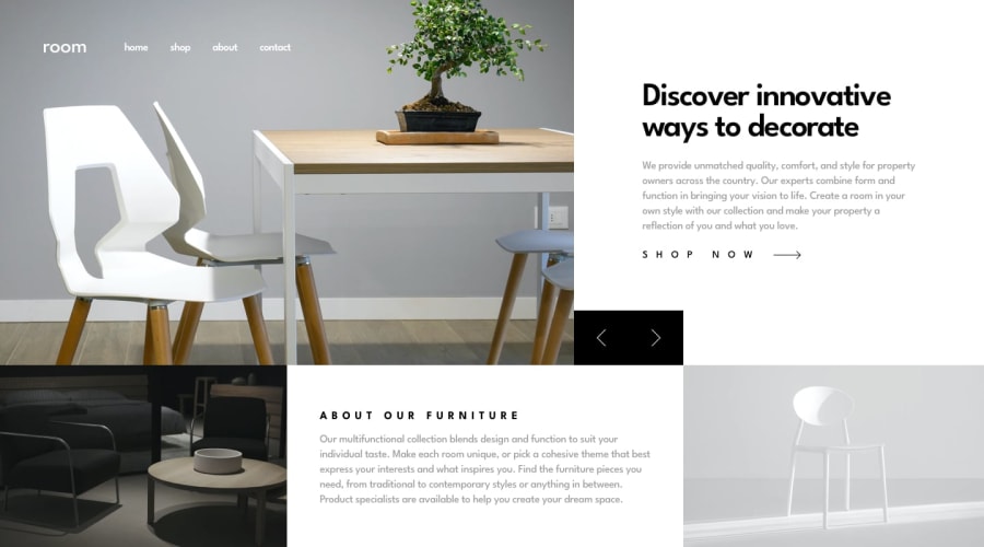
Design comparison
Community feedback
- @BT453567Posted 4 months ago
Hello
Good effort.
In desktop view, have a look at implementing the solution with grid as currently there are some overlap issues when re-sizing the window:
https://css-tricks.com/snippets/css/complete-guide-grid/
On the image container try adding overflow: hidden because at the moment when you press the next image button, you can see the image swipe across other parts of the page.
With regards to the arrow buttons, try adding cursor: pointer to them and also a hover function to change the background colour.
In mobile view, Try using position: absolute on the arrow buttons, with the container as position: relative so that you can position the buttons in the bottom right of the image.
Regards
1

Please log in to post a comment
Log in with GitHubJoin our Discord community
Join thousands of Frontend Mentor community members taking the challenges, sharing resources, helping each other, and chatting about all things front-end!
Join our Discord