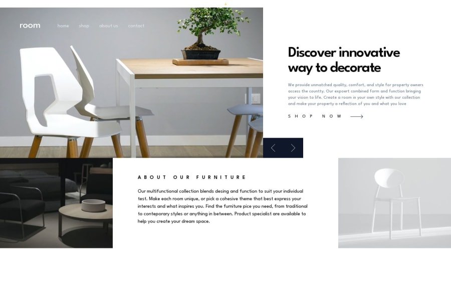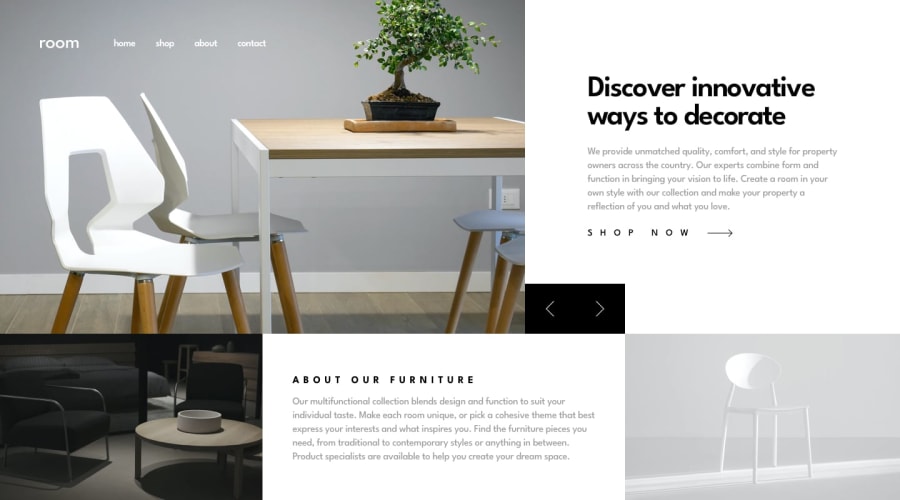
Room Homepage made with Next.js and Tailwindcss
Design comparison
Community feedback
- @G-GakiiPosted 7 months ago
-
Congratulations on finishing this challenge—it looks fantastic!
-
For further improvement, you can use Lighthouse to evaluate accessibility. The buttons in AngleArrowLeft.js and AngleArrowRight.js currently lack accessibility. Consider adding an aria-label attribute to these buttons to provide a clear and descriptive name.
-
The title also gives screen reader users an overview of the page, and search engine users rely on it heavily to determine if a page is relevant to their search. this will also improve your seo
0 -
Please log in to post a comment
Log in with GitHubJoin our Discord community
Join thousands of Frontend Mentor community members taking the challenges, sharing resources, helping each other, and chatting about all things front-end!
Join our Discord
