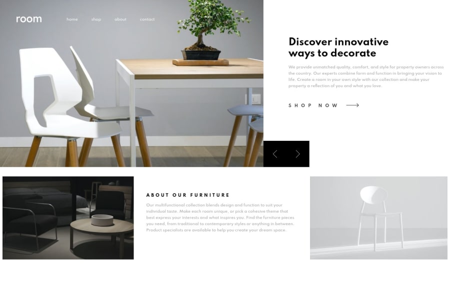

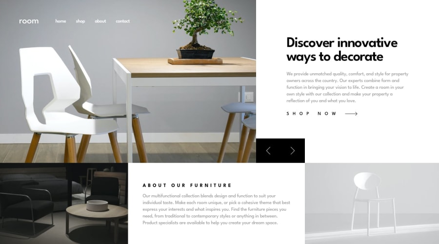
Design comparison
Solution retrospective
Any feedbacks are very appreciated 🙏
I really want your opinions , and what should I improve ?
thanks in advance 🙏
Community feedback
- @JunjiequanPosted almost 4 years ago
Hey Karimsamir112,
I can see you have put some efforts in this one and I would love to point out some issues that I have found.
The layout is broken on my screen( resolution 1920 x 1080). The first section image occupies 80% of the screen and left a huge white space gap on the bottom.
Also, there's some issue with space gap between first section and second section when it is resized between range from 1450px~ 1110px.
Another one crucial issue is that first section image is streched to very wide or narrow when it resizes..I can see you've set the height to 550px in media query at 1100px max-width. I would avoid to set fixed height to image directly, instead I would use max-height or min-height in that case for better responsiveness of image.
If you need some reference and don't mind to look at a newbie's solution Here is my solution
Hope my feedback helps and happy coding. 😃
0

Please log in to post a comment
Log in with GitHubJoin our Discord community
Join thousands of Frontend Mentor community members taking the challenges, sharing resources, helping each other, and chatting about all things front-end!
Join our Discord