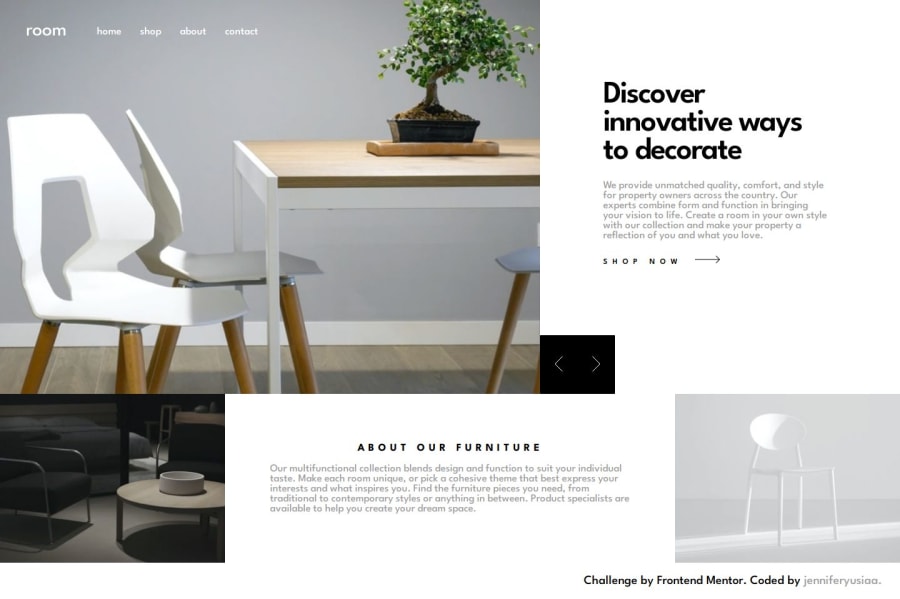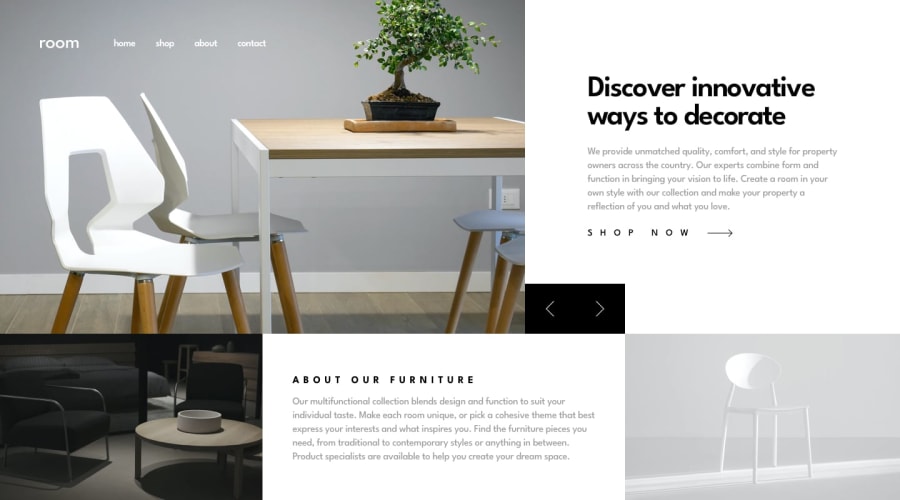
Room Homepage (HTML with CSS)
Design comparison
Solution retrospective
No problem with the desktop screen, but may something wrong for mobile user in responsive things.
Community feedback
- @Edarth002Posted about 1 year ago
Okay, nice job, but adding the mobile menu at the bottom of your HTML file will only cause this kind of issues; Even when you set it to {display:none;}, HTML still detects that there is a component there and gives it due space, try another approach such as @mediaquery on the same Nav link giving it different styles for different screens and focus the toggling function on the menu bar which should only appear on smaller screens
1
Please log in to post a comment
Log in with GitHubJoin our Discord community
Join thousands of Frontend Mentor community members taking the challenges, sharing resources, helping each other, and chatting about all things front-end!
Join our Discord

