Room Homepage (HTML, CSS, jQuery) with animation
Design comparison
Community feedback
- @Rosi-TPosted about 3 years ago
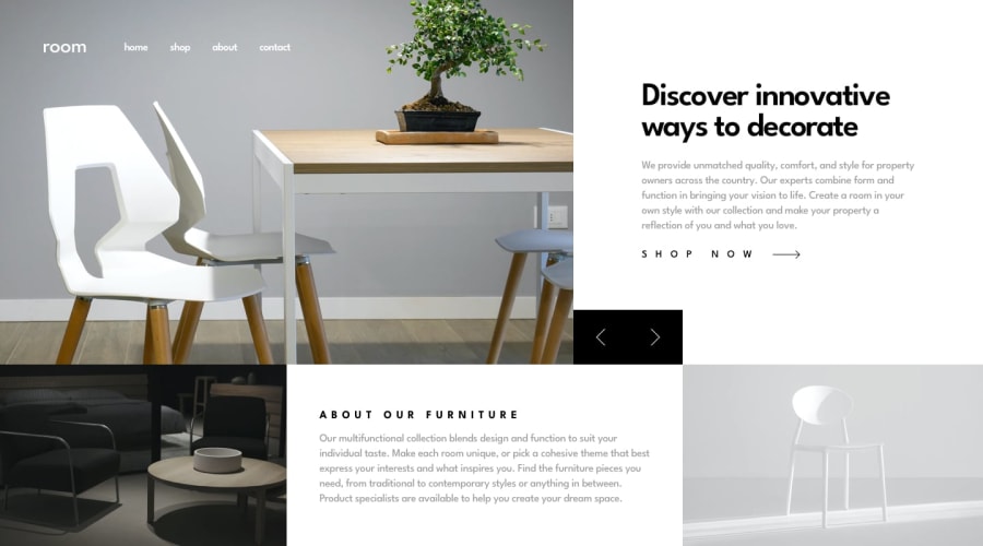
Hey! On desktop view, there is white space between the arrows and the image to the left. Also i feel like the text should end a little bit above the arrows like - shop now -> then some space below and then the black block with the arrows. I guess you could change the font size of the title and lessen the top padding to get some space there.
0@bawalidPosted about 3 years ago@Rosi-T Hey, thank you for the feedback. It's strange but everything seems good to me on both Chrome and safari browser, with different screen size. No white gap or condensed text.
0@Rosi-TPosted about 3 years ago@bawalid Hey, here is a screenshot of my screen: https://prnt.sc/1vm3c4z
The space between the arrows and the text above it looks fine now. I am watchin this on an 17" screen, if that helps. You can use Ctrl + or Ctrl - to see how it would possibly look on bigger on smaller screen, though with not very trustable accuracy. So when i press Ctrl + once, the arrows are where they should be. (press Ctrl 0 to reset to original size)
0
Please log in to post a comment
Log in with GitHubJoin our Discord community
Join thousands of Frontend Mentor community members taking the challenges, sharing resources, helping each other, and chatting about all things front-end!
Join our Discord
