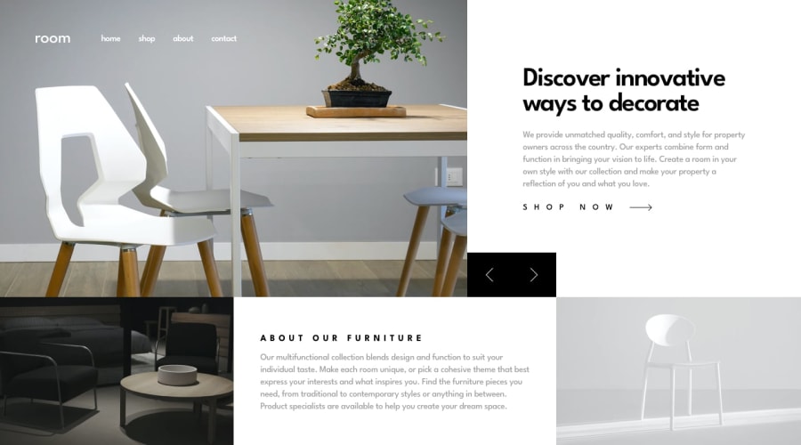
Design comparison
Solution retrospective
Hi there! Any feedback would be very much appreciated, thank you! 🙂
Here are a few things I believe would improve my solution (but did not succeed to do by myself):
- A CSS or JS animation for a better transition between the different images and texts (fade in/out or slide from the left)
- After the menu icon is clicked on the mobile version, the whole navigation bar should go back to its original state if the screen is set back to desktop (even if the close icon is not clicked before leaving the mobile screen size)
Community feedback
- @statanasovaPosted almost 4 years ago
Hi Axelle,
I think you've done a fantastic job on this challenge! I am especially impressed with your use of CSS Grid - everything is in it's right place, the buttons of the slider align with the bottom right image. Really great job :) I am definitely inspired to have one more attempt at this challenge.
I can only think of one tip right now - for designs that span the full view height
100vh, try setting some min-heights, so the content won't squish too much and all top-bottom padding won't dissapear when the viewport becomes much smaller.Keep it up!
Ps. Upvote if you found any of this helpful :)
2@axellesarrayPosted almost 4 years agoThanks a lot @statanasova for the compliments and the feedback! It's my first time sharing my work with the community and that really is encouraging. I'll definitely keep on working on some new challenges! 🙂
I plan on making some research about height/min-height to make sure I totally understand the difference. Thanks again!
1
Please log in to post a comment
Log in with GitHubJoin our Discord community
Join thousands of Frontend Mentor community members taking the challenges, sharing resources, helping each other, and chatting about all things front-end!
Join our Discord

