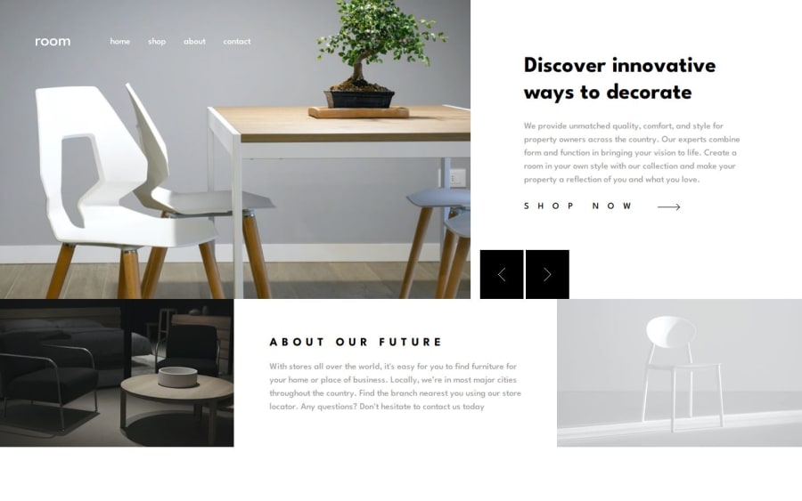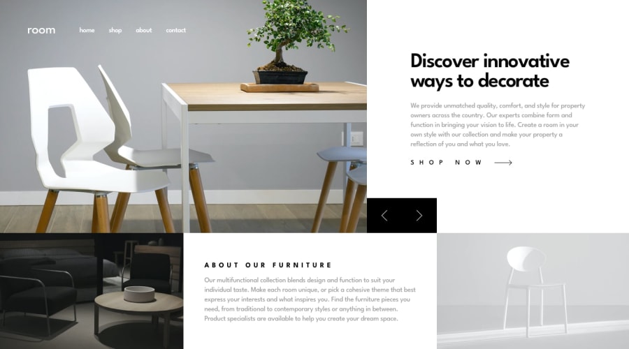
Design comparison
SolutionDesign
Solution retrospective
What specific areas of your project would you like help with?
my desktop layout doesnt look good , mobile is fine any help will be appreciated
Community feedback
- @dar-juPosted 2 months ago
Hi Sandaruwan!
Good job!
But there are a few things that need to be improved:
- It's better to make the button group relative to the .shopNow class, you can make
bottom: 0,left: 0and the buttons will be clearly fixed. Then move them when the screen is compressed - When zooming out, the header goes beyond the edges, it's better to use containers to avoid this
- At a screen resolution of 1200-1330, the carousel section breaks away from the second block, you need to work on the height of the blocks and images
- At a screen resolution of 870-1200, the buttons go beyond the screen (solution above)
- At a screen resolution less than 300, the close menu button goes beyond the screen. Make the .nav__area class flex-wrap: wrap; and adjust the height of the menu items for beauty
- Semantically, you are using the section tag incorrectly, there should be no wrap of a section within a section. There are only 2 sections on this page: carousel and "about"
- Your carousel only changes images, title and text should change too
- No focus on "Shop now" link
- If you use style files, don't write styles in html file. It makes code maintenance difficult
Otherwise everything is fine, good luck with development!
0 - It's better to make the button group relative to the .shopNow class, you can make
Please log in to post a comment
Log in with GitHubJoin our Discord community
Join thousands of Frontend Mentor community members taking the challenges, sharing resources, helping each other, and chatting about all things front-end!
Join our Discord
