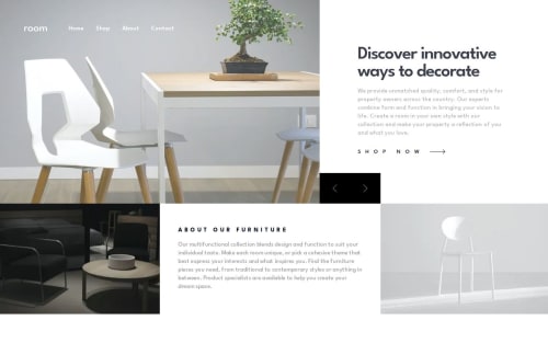
Submitted over 1 year agoA solution to the Room homepage challenge
Room Homepage Challenge
motion, react, tailwind-css, next

P
@robcrock
Solution retrospective
What are you most proud of, and what would you do differently next time?
This only took me a few hours to build and I think it looks great. I'm definitely learning a lot by continuously going through challenge after challenge.
What challenges did you encounter, and how did you overcome them?The mobile menus are always tricky, but it was easier to tackle that after creating components out of blocks of that code.
What specific areas of your project would you like help with?Code organization and responsiveness of this site. It looks good on mobile and desktop, but not much in between.
Code
Loading...
Please log in to post a comment
Log in with GitHubCommunity feedback
No feedback yet. Be the first to give feedback on Robert Crocker's solution.
Join our Discord community
Join thousands of Frontend Mentor community members taking the challenges, sharing resources, helping each other, and chatting about all things front-end!
Join our Discord