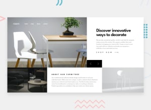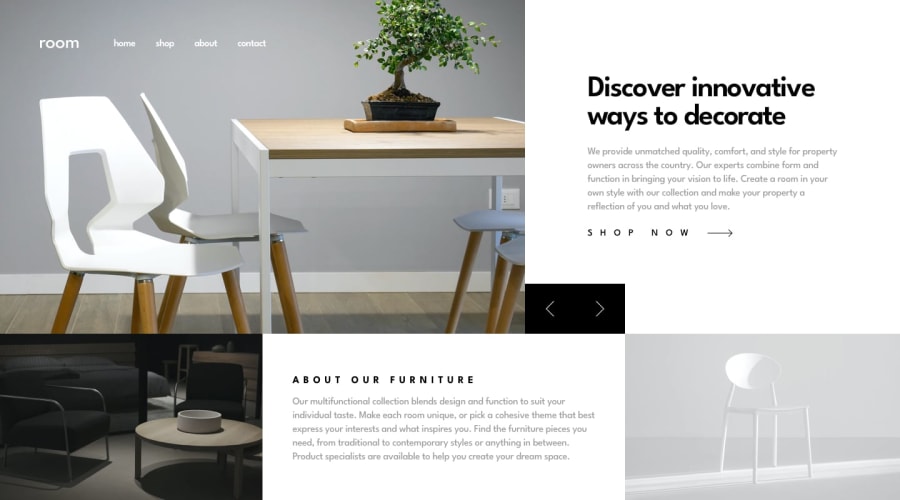
Design comparison
SolutionDesign
Solution retrospective
What are you most proud of, and what would you do differently next time?
First time adding animation to my page, using Z-index so the article apears from underneath the image. The content for the nav image and the article text and link are pulled from an array and appended to the dom.
What challenges did you encounter, and how did you overcome them?The main challenges were the slider animation not the slider itself and making the desktop layout being responsive without overflow on larger viewports.
What specific areas of your project would you like help with?Having my desktop media query dynamically adjust so it takes up 100% of the viewport and having my article height staying fixed so that it does not appear to jump on desktop. There still appears to be some overflow.
Join our Discord community
Join thousands of Frontend Mentor community members taking the challenges, sharing resources, helping each other, and chatting about all things front-end!
Join our Discord
