Submitted almost 2 years ago
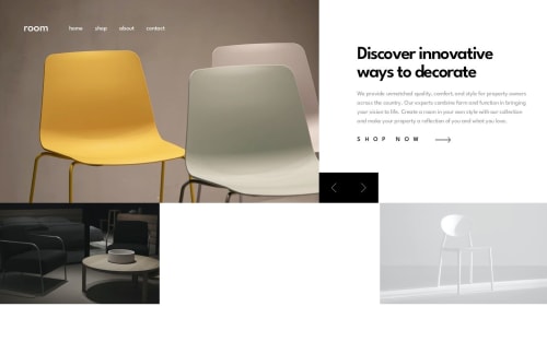
Responsive for mobile and desktop, React, React-awesome-reveal.
@Dytoma
Design comparison
SolutionDesign
Solution retrospective
Hey π,
This is an updated solution. I would like get your feedback on this solution, check out my code on Github and let me know if there is something I can improve or I could do better.π
Happy coding
Community feedback
- @ApplePieGiraffePosted almost 2 years ago
Greetings, Dytoma Omar! π
Nice effort on this challenge! π
I'd like to suggest,
- Not using a heading tag for the "Shop now" link (since it is not a headingβin this case, using an
a
tag is enough). π - Using the
ul
andli
tags for the list of links in the navigation of the site to make your HTML a little more semantic. - Making this layout responsive can be tricky! Currently, there are a few issues such as the text in the bottom box overflowing its container and the text in the top box getting hidden when the screen width decreases in the desktop layout. You may want to take another look at those elements and ensure that they look good and can be seen at all screen sizes. If you'd like some ideas, you can check out my solution to this challenge (it's not perfect, but it may help). π
Hope you find these suggestions helpful. π
Keep coding (and happy coding, too)! π
Marked as helpful1@DytomaPosted almost 2 years ago@ApplePieGiraffe Thanks for your feedback, I will definitely check this out.
1 - Not using a heading tag for the "Shop now" link (since it is not a headingβin this case, using an
Please log in to post a comment
Log in with GitHubJoin our Discord community
Join thousands of Frontend Mentor community members taking the challenges, sharing resources, helping each other, and chatting about all things front-end!
Join our Discord