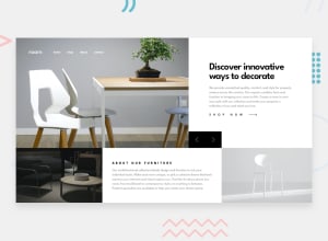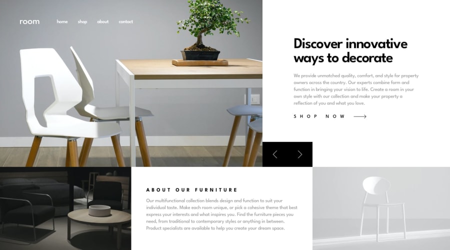
Design comparison
Solution retrospective
Hi everybody!
This is my first challenge using BEM, SASS, Web Animations API and Parcel.
I would really appreciate if you review my code. 🐙
Community feedback
- @TalhaAmjad0034Posted over 3 years ago
I like the use of Scss in Media queries, and that black animation slider. You did a lot on that amazing slider. But after closing navbar in mobile version it shows some horizontal lines, I've seen your code, But I'm not sure where those are coming from, maybe it can be my browser issue. but in the end I give you 5 star you did a great job.
0@mcornalePosted over 3 years ago@arywahhh
I will give it a check. Thank you for the feedback!
0 - @palgrammingPosted over 3 years ago
⭐⭐⭐⭐⭐ Looks fantastic
in mobile view I am not sure how tall the photos should be but the hero images in mobile seem like they could be shorter so the focal points of the images were more in view and in proportion to the mobile screen size
But I liked everything else you did a lot
0@mcornalePosted over 3 years agoHi @palgramming, thank you so much!
I was trying to fix a bug giving the images container a fixed height and that's why they were like that but now it is resolved in a better way.
0@palgrammingPosted over 3 years ago@mcornale Yep, that is a result totally worth a 🌠 bookmark again 🌟🌟🌟🌟🌟 job on your solution
0
Please log in to post a comment
Log in with GitHubJoin our Discord community
Join thousands of Frontend Mentor community members taking the challenges, sharing resources, helping each other, and chatting about all things front-end!
Join our Discord
