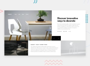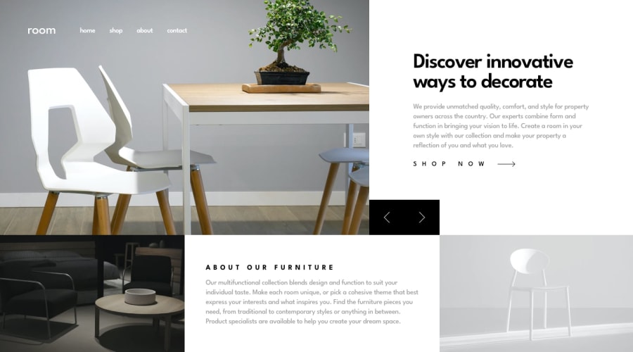
Design comparison
Solution retrospective
I am very proud because I managed to place some elements to the desired position with grid layout without using position: absolute. CSS grid is definitely an awesome tool!
What challenges did you encounter, and how did you overcome them?Making the desktop layout is something that I got struggled with. I constructed the mobile layout by using display grid with grid-template areas. I managed to do the desktop layout by erasing the grid template areas and using the grid-row and grid-col to place the elements
What specific areas of your project would you like help with?The typography size is something that I can't do I an efficient way espessially when the screen size gets too big or too small. I think that I need to study and see example of how to deal with this. Also I need to work on establishing correctly the sizes between grid rows and columns.
Please log in to post a comment
Log in with GitHubCommunity feedback
- @sudhanshusingh-g
Close to the design.Keep up the good work!
Join our Discord community
Join thousands of Frontend Mentor community members taking the challenges, sharing resources, helping each other, and chatting about all things front-end!
Join our Discord
