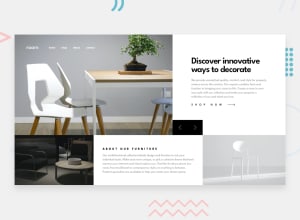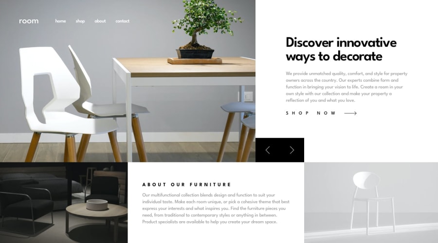
Design comparison
SolutionDesign
Solution retrospective
My first solution of the room-homepage challenge
Kindly review my code and drop some helpful reviews Thanks in advance 🥰
Community feedback
- @Dhei-vidPosted almost 2 years ago
I would like to commend you the good job, however there are some areas you could work on.
Navigation button: An idea is to use flex or grid to style your buttons. Padding: Your padding for the text is too much, you should use less as seen in the designs. Images: You need to resize and position your images to fit the content (research on this and find the best method possible).
Marked as helpful0
Please log in to post a comment
Log in with GitHubJoin our Discord community
Join thousands of Frontend Mentor community members taking the challenges, sharing resources, helping each other, and chatting about all things front-end!
Join our Discord
