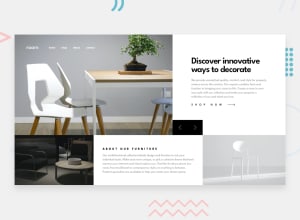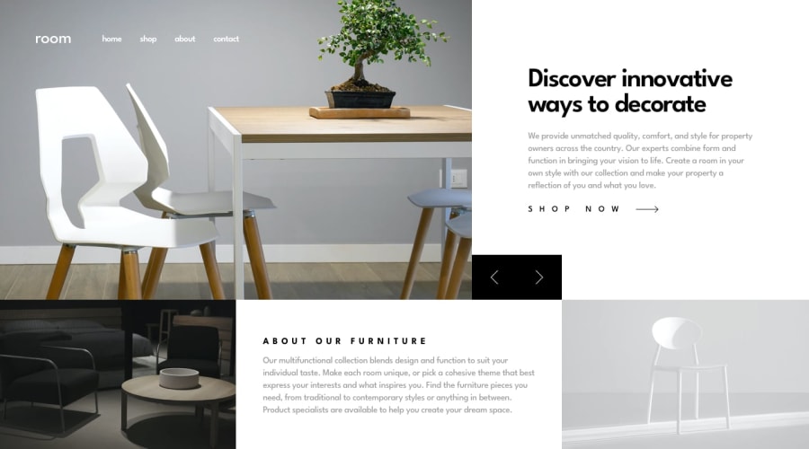
Design comparison
Solution retrospective
wow, this was a challenge but I got there. learnt a lot from this project. on to the next one
Community feedback
- @mattstuddertPosted about 4 years ago
Nice work on this challenge, Dean. It's not an easy layout and you've done a good job at replicating it. If there was one area that I'd say could be improved it's the responsive side of it. The slider navigation arrows disappear on tablet sizes and the content on mobile looks a little squashed vertically.
But you've done a really good job. Keep up the great work! 👍
0@jaggysnake57Posted about 4 years ago@mattstuddert The button is a visual bug and an easy fix, ill get to it at some point this week. while im at it ill fix the spacing on the about div. thanks for the comment.
0
Please log in to post a comment
Log in with GitHubJoin our Discord community
Join thousands of Frontend Mentor community members taking the challenges, sharing resources, helping each other, and chatting about all things front-end!
Join our Discord
