Submitted almost 2 years ago
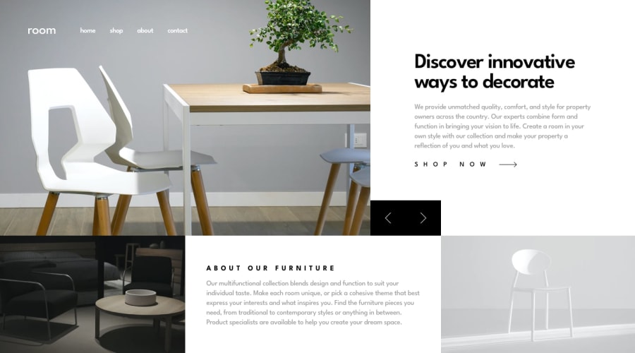
Room homepage using grid-area and responsive design
@jefcooper
Design comparison
SolutionDesign
Solution retrospective
I could use some advice on accessibility for this challenge. The carousel seems like an anti-pattern for a11y, but maybe there are some techniques I can apply to make it a bit better.
Community feedback
Please log in to post a comment
Log in with GitHubJoin our Discord community
Join thousands of Frontend Mentor community members taking the challenges, sharing resources, helping each other, and chatting about all things front-end!
Join our Discord
