
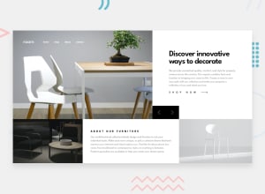
Design comparison
Solution retrospective
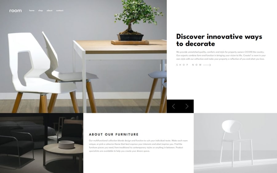
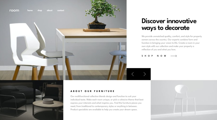
The image carousel is what I am most proud of.
What challenges did you encounter, and how did you overcome them?I had to give some thought on how the image carousel would work.
I have ensured the image displayed is from the picture/img element as I find it easier to control the size of the div's to ensure they are displayed correctly and the grid is shaped correctly.
When the user presses the left or right button, the next image is dynamically placed next to the current image and then moves across. This ensures that windows resizes are easily managed for the images.
What specific areas of your project would you like help with?Any feedback would be welcomed.
Community feedback
- @krushnasinnarkarPosted 4 months ago
Hi @BT453567,
Congratulations on successfully completing the challenge!
Your solution looks nice, though there are a couple of things you can improve which I hope will be helpful!
1. Using
height: 100vhInstead ofheight: 100%Instead of using
height: 100%;for thebody, useheight: 100vh;.Reason:
100vhrefers to 100% of the viewport height, ensuring that the body always fills the full height of the browser window, even if the content is less than the viewport height. This prevents issues where the body might not fully stretch to the bottom of the viewport.body { height: 100vh; }2. Preventing Stretching on Large Screens
Your website keeps stretching as we increase the screen size because you use
width: 100%in.grid-container. You can solve this issue by using amax-widthof1440pxinstead ofwidth: 100%.After doing this, you might need to center the
.grid-containerhorizontally, as it will get aligned to the left by default. You can center it by making thebodyelement a flex container and usingjustify-content: center.body { display: flex; justify-content: center; } .grid-container { max-width: 1440px; width: 100%; }3. Making the Header (nav) Sticky
One more improvement you can do is make the header (nav) sticky so that users can always see the header when they scroll.
header {
    position: sticky;
    top: 0;
    z-index: 1000; /* Ensure it stays above other content */
}
Summary
- Use
height: 100vhfor thebodyto ensure it fills the viewport height. - Apply
max-width: 1440pxto.grid-containerand center it using flexbox on thebody. - Make the header sticky for better navigation visibility.
I hope you find this helpful, and I would greatly appreciate it if you could mark my comment as helpful if it was.Feel free to reach out if you have more questions or need further assistance.
Happy coding!
Marked as helpful1@BT453567Posted 4 months agoHello @krushnasinnarkar
Thanks for those recommendations
I like the animations you have used on your solutions
0@krushnasinnarkarPosted 4 months agoThank you, @BT453567, for appreciating my animation! You can check out my repository code to see how I implemented it.
Feel free to reach out if you have any more questions or need further assistance.
Happy coding!
0 - Use

Please log in to post a comment
Log in with GitHub
Join our Discord community
Join thousands of Frontend Mentor community members taking the challenges, sharing resources, helping each other, and chatting about all things front-end!
Join our Discord