Design comparison
Solution retrospective
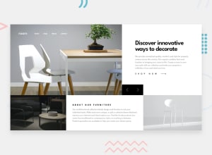
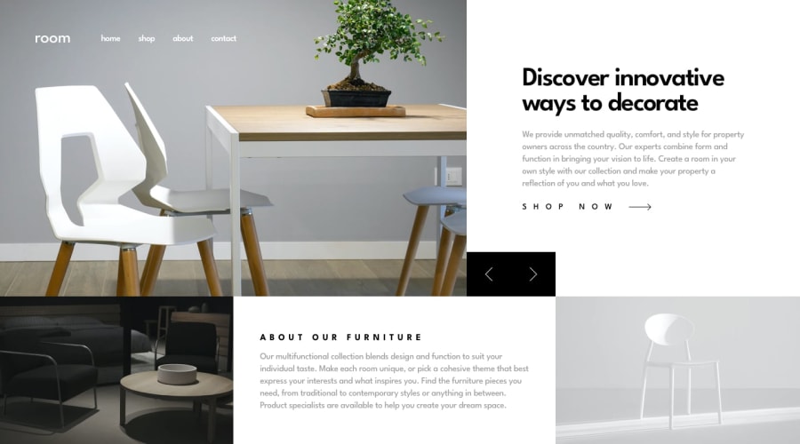
Hi guys, do checkout my solution to room home page challenge. Review my code and suggest any improvements in the code.✌
Community feedback
- @JustShuaibPosted over 2 years ago
Hi there. On desktop, the shop now button falls into the image below it,maybe you should find a way to fix it. I also noticed that your slider works but once it reaches the ending,it stops working. It would be nice if it could go back to the first image. Also, one of the requirements of the challenge is that the slider should be navigatable using the either the mouse or the keyboard. I can't navigate this using the keyboard. Your banner looks stretched both on mobile and desktop. Maybe reduce the height on mobile and reduce the width on desktop.
Nice work tho, and happy coding.
Marked as helpful0
Please log in to post a comment
Log in with GitHubJoin our Discord community
Join thousands of Frontend Mentor community members taking the challenges, sharing resources, helping each other, and chatting about all things front-end!
Join our Discord
