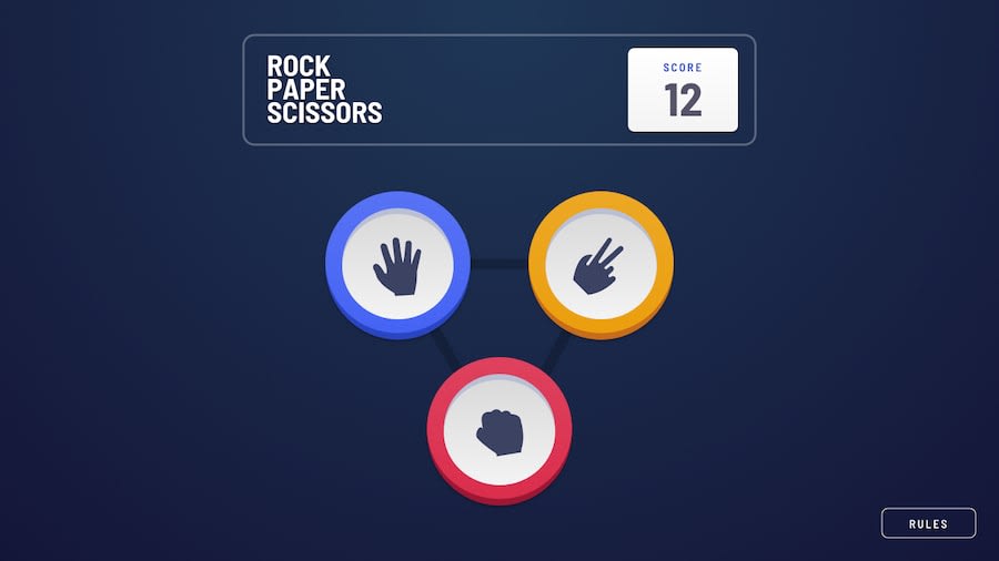
Design comparison
Solution retrospective
- I have changed the dimensions for better UX.
- I will develop the bonus for later.
Community feedback
- @bbsmoothdevPosted 11 months ago
This looks very nice. I like the animation on the results. A few suggestions for accessibility improvements. You can't use the keyboard to play this game. That's because you used
divs instead ofbuttons. Don't make it a habit to add event handlers todivs. If you are adding a click handler to an element, then it should be an element that can be clicked by both the mouse and keyboard, such as abutton.Also, widen your browser to
1280px(it can be approximate) and then zoom in 400%. You'll see that you can't access the score. You'll want to fix that. Many people with bad vision will need to zoom in that far in order to see the page. They need to be able to see the score as well.1
Please log in to post a comment
Log in with GitHubJoin our Discord community
Join thousands of Frontend Mentor community members taking the challenges, sharing resources, helping each other, and chatting about all things front-end!
Join our Discord
