


Design comparison
Solution retrospective
Animating shadows is generally not advised but I had no other choice since shadows on my ::after pseudo element weren't visible. If I set the shadow to inset then it would work but not otherwise. My best guess is maybe it had something to do with the stacking context.
Community feedback
- @AmanpreetSingh1995Posted over 2 years ago
Hi, I am not that good at coding yet but from what I can see, you need to do some changes.
-
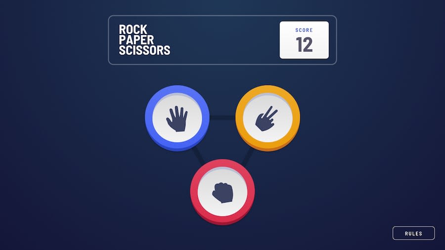
You need to decrease the size of the rock paper scissors buttons on the main page. They are a lot bigger on the screen even if they are the same size as given in the design.
-
You need to check the rules modal design.
-
You need to add score value as well starting as 0.
Other than that, You have done an amazing job at making this, even better than my own solution. Keep up the work :). Your solution is really amazing , I really love it
Marked as helpful1@de-sipherPosted over 2 years ago@AmanpreetSingh1995 Thanks a ton! I improved upon all of those points. Feel free to look again for any remaining flaws.
Also thanks for the compliment. Some appreciation goes a long way. Cheers!
0@AmanpreetSingh1995Posted over 2 years ago@de-sipher I am looking at your edited code and the heading rules and the close icon should be in same row on desktop version :) Other than that it looks nice now
1 -

Please log in to post a comment
Log in with GitHubJoin our Discord community
Join thousands of Frontend Mentor community members taking the challenges, sharing resources, helping each other, and chatting about all things front-end!
Join our Discord