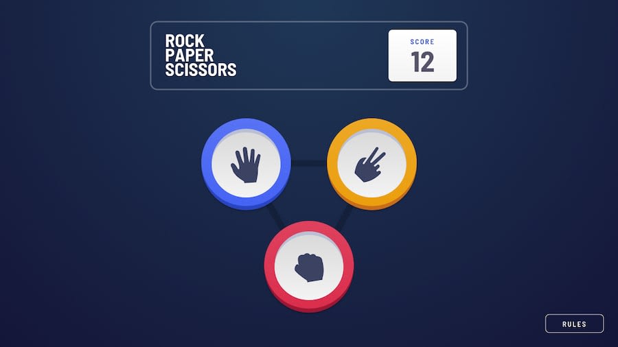
Rock-Paper-Scissors using Pure JavaScript | Feedbacks Appreciated :-)
Design comparison
Solution retrospective
It is not responsive in some place , bcoz i used pixels in some places to make it responsive. All Pull request are accepted in my repo to make it responsive .
Community feedback
- @AlexKMarshallPosted about 3 years ago
This looks very nice, and the animations are nice and smooth. For my taste the timing delay between each element animating in at the end of a round is a bit slow. It makes the overall experience feel a bit sluggish.
It could use some clearer
:focus-visiblestyling. There are focus rings on things that probably shouldn't be interactive. For instance the player's choice after they have played, it's a button element, but clicking on it does nothing, so maybe it should just be a span, or at least have a disabled attribute. And things that actually are interactive - like the play again button - have had focus styling removed, so you can't tell when they've been selected with the keyboard.The javascript is nice and readable (though try and avoid committing commented out code and console logs to main). It might be appropriate to move the box shadows to a css class and toggle that, rather than applying them as inline styles in the javascript. It would make it easier to maintain when you want to change those styles.
Marked as helpful1@exist08Posted about 3 years ago@AlexKMarshall very helpful , thanks . I'll search about those seudo selectors you talked about.
0
Please log in to post a comment
Log in with GitHubJoin our Discord community
Join thousands of Frontend Mentor community members taking the challenges, sharing resources, helping each other, and chatting about all things front-end!
Join our Discord
