Design comparison
SolutionDesign
Solution retrospective
Please feel free to give me any feedback! . Thanks
Community feedback
- Account deleted
Hi,
The game play is pretty nice, and the animation it does to pick the house's choice looks good, and the sound effects are a big plus;
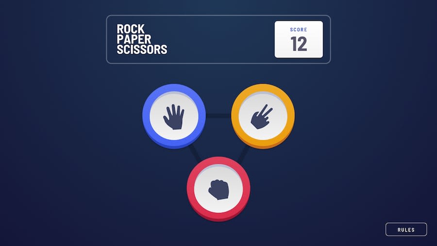
- I think the styling is where things fell short because the hands are way too small compared to the design.
- As you start resizing the window a lot of stuff is moving, and the hands lose their position on the pentagon a number of time.
- As you first switch to mobile, the rule button takes half the screen's width, if not more, and some things are a bit stretched.
0
Please log in to post a comment
Log in with GitHubJoin our Discord community
Join thousands of Frontend Mentor community members taking the challenges, sharing resources, helping each other, and chatting about all things front-end!
Join our Discord
