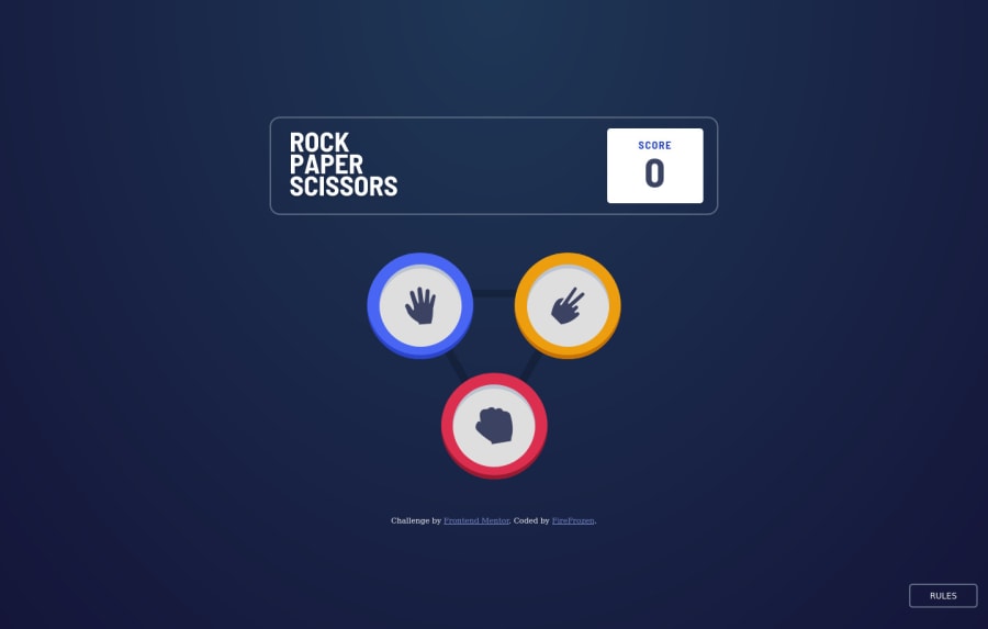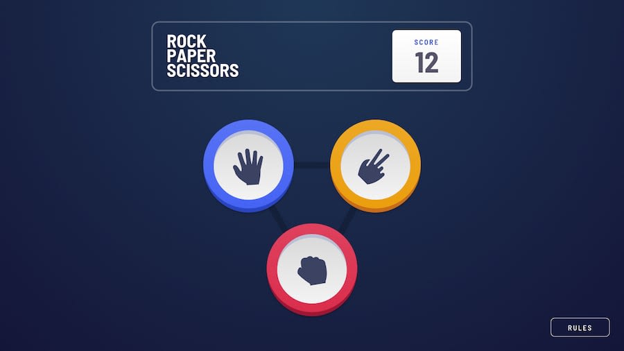
Design comparison
Solution retrospective
Hi, this is my solution for this challenge. 💻
⚙️ Features:
- This solution is for the basic game with 3 elements. 🪨 📃 ✂️
- The state of the score is maintained after refreshing the browser. 💯
- Layout optimized for desktop and mobile screen 🖥️ 📱
- Added an additional layout for sizes between mobile and desktop for more accessibility. 🔧
Suggestions and feedback are welcome! 👍
Community feedback
- @marissahuysentruytPosted over 1 year ago
Hey @FireFrozen, nice work! I love the script for keeping the score between refreshes! 🔥
I've been learning a lot lately about accessibility (Global Accessibility Awareness Day is coming up in May!). I wonder if you could refactor this so that the game is keyboard accessible. Unfortunately, if I was someone who couldn't or preferred not to use a mouse for some reason (I'm thinking of people with fine motor issues like Parkinson's or severe arthritis, or with disabled arms/hands, etc), I can't seem to navigate to the rock, paper, scissors options! ☹️
Right now, if I try to tab or navigate to the game with only the keyboard, I can only get to the
Rulesbutton and the attribution links. I bet if the rock/paper/scissors were buttons instead, then someone who is using their keyboard would be able to participate! 🥳Inside the
Rulesmodal, there's also tons of improvements that could be made so that the modal is also WCAG compliant. The Deque example is pretty good, fairly simple, and shows that in order to be accessible, a modal has to have particular keyboard functionality (like the trapped focus), has some other semantic features, and more. Here's another good page to learn about some basic accessible modals.Well done!
Marked as helpful1
Please log in to post a comment
Log in with GitHubJoin our Discord community
Join thousands of Frontend Mentor community members taking the challenges, sharing resources, helping each other, and chatting about all things front-end!
Join our Discord
