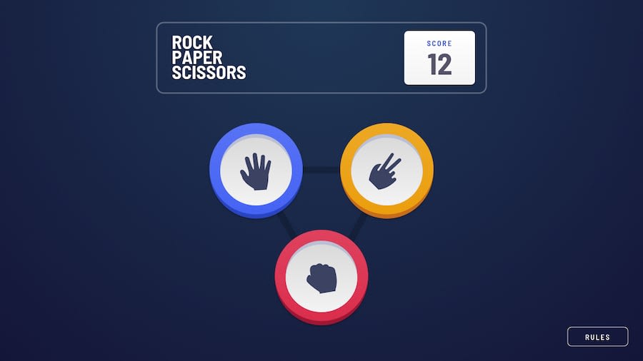
Design comparison
SolutionDesign
Community feedback
- @UserAhmad2001Posted over 2 years ago
Hello sbinnala 👋
I see that you have also completed the rock paper scissors challenge. I noticed that you didn't add the shades to the buttons design, I was also stuck at that part for a long time. 😅😅
If you want to add it to the design, here's how you do it:
- nest the rock_paper_scissors images inside a container
- add below styling to the container:
    box-shadow: inset 0 0.3rem 0 2px rgb(64 64 64 / 25%)
                    , 0 0.5rem 0 0px rgb(162 21 47);
    border: 1.6rem solid #dc3550;
Marked as helpful1
Please log in to post a comment
Log in with GitHubJoin our Discord community
Join thousands of Frontend Mentor community members taking the challenges, sharing resources, helping each other, and chatting about all things front-end!
Join our Discord
